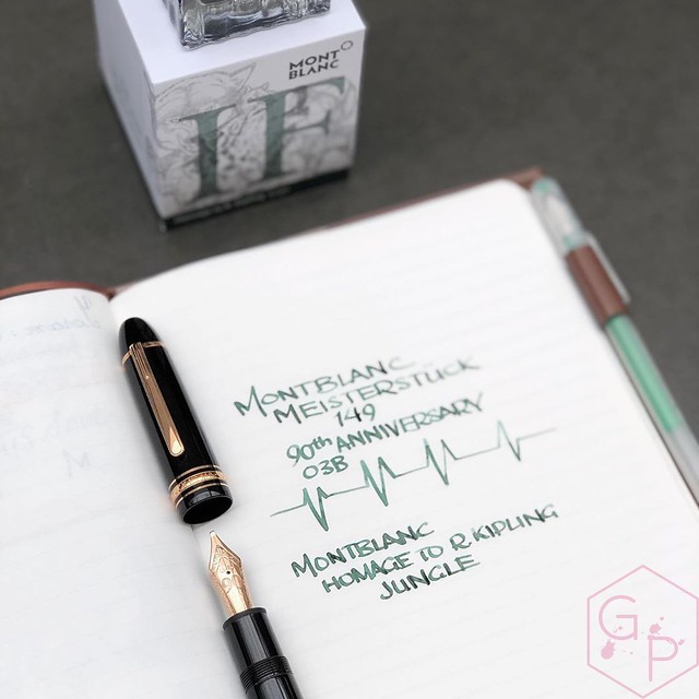
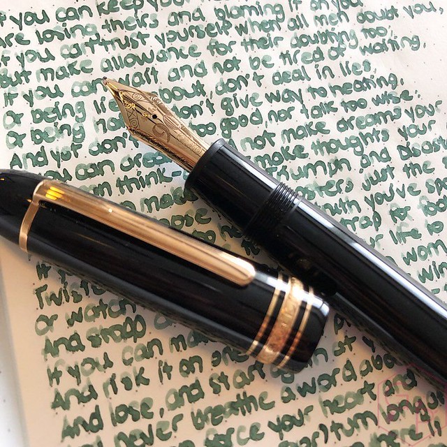
When I first posted about this ink back in July of 2019 (um a lifetime ago and my anxious mind did not even consider a pandemic would be coming up), my first question was, do you want a swab or a writing sample? Personally, I pick inks based on swabs even though it's completely illogical for most because it never looks the same in writing. Since I tend to use folded nibs and BBBBBB nibs anyway, swabs are actually not too far off for my personal use. Alas, the people spoke! Most of you voted for a writing sample - that thing about swabs not being indicative of actual use.
The doesn't have many hues but it does shade fairly well. It's a light, clean, sage-jungle green. I don't picture a tropical jungle so much as an urban jungle - a flatter, less vibrant color than an intense green tropical green. It's a good looking color that is unique to my ink stash. It seems like a green that is for those who don't care for greens all that much. I did not find it that different from the writing sample - it is not a particularly complex ink. No sheen, but quite some shading. I like it and I think it’s quite lovely. Well-behaved, easy to clean. I didn't find it particularly wet - ink flow was consistent and reliable. Would I bother using this in a fine nib? Absolutely not. It's a broad nib, at minimum. Or a flex nib. It would just bore me if it was in a fine nib. I don't have a picture to show you because I discovered this by accident when I spilled water on my journal but it looks great as a color wash. It has strange grey tones to it that I really like.
Three Montblanc ink swabs: Emerald Green, Irish Green, Kipling Jungle Green. Quite the range of greens!
Sometimes I even use it with a normal nib size, such as this vintage Esterbrook flex nib (on a modern Esterbrook Estie). It's really legible and is easy on the eyes. I'd consider this pretty work appropriate.
Just for fun, let's throw the pen and notebook in for a glance. I usually don’t care for the modern Montblancs all that much, except for last year with the Homer and this one. Why? The horse from last year and the wolf on this one. I’m a sucker that way. Also, things named after food. I mean, look at these wolves!
If you want to see my review of the fountain pen and check out the notebook and ink, you can see the video here!
Tuesday, June 30, 2020
Montblanc Writer's Edition Homage to R. Kipling Jungle Green Ink
Labels:
Appelboom,
fountain pen ink,
ink,
inks,
Montblanc,
Special Edition
Friday, June 26, 2020
Handwriting with Leonardo Furore Gold Nib Fountain Pen
Oddly satisfying, quite lovely and fun!
See more Leonardo pens if you are curious about them - I have a full unboxing of this particular pen with the gold stub nib you see in action.
Leonardo Furore Emerald Turquoise Fountain Pen + 14KT Stub Nib (full video review)
If you are curious about the two most popular Leonardo pens models in this size - the MomentoZero and the Furore - check out the comparison below. I also compare the gold and steel nib options, which might help with your decision making!
Leonardo Officina Italiana Furore vs. MomentoZero Fountain Pens with Gold & Steel Nibs
See more Leonardo pens if you are curious about them - I have a full unboxing of this particular pen with the gold stub nib you see in action.
Leonardo Furore Emerald Turquoise Fountain Pen + 14KT Stub Nib (full video review)
If you are curious about the two most popular Leonardo pens models in this size - the MomentoZero and the Furore - check out the comparison below. I also compare the gold and steel nib options, which might help with your decision making!
Leonardo Officina Italiana Furore vs. MomentoZero Fountain Pens with Gold & Steel Nibs
Tuesday, June 23, 2020
Handwriting and Lettering with the Platinum #3776 Celluloid Karakusa Blue Coarse Nib
A friend loaned me this pen a little while ago and I have already unboxed it, in case you missed it, and if you have missed it I urge you to watch the video because it's truly beautiful and comfortable and I love writing with it. I made a short little video of some handwriting and lettering with it.
The coarse nib is super juicy and smooth but this one is perfectly polished and tuned so it doesn't have any sign of overpolishing/baby's bottom. No skipping, no hard starts. Combined with Platinum's Slip & Seal cap mechanism that prevents the nib from drying out, it's pretty perfect. I love the super round nib shape for lettering, though many people might not find it useful for daily writing. I use it for daily writing, though!
I hope you enjoy the video!
The coarse nib is super juicy and smooth but this one is perfectly polished and tuned so it doesn't have any sign of overpolishing/baby's bottom. No skipping, no hard starts. Combined with Platinum's Slip & Seal cap mechanism that prevents the nib from drying out, it's pretty perfect. I love the super round nib shape for lettering, though many people might not find it useful for daily writing. I use it for daily writing, though!
I hope you enjoy the video!
Music: BenSound https://www.bensound.com/royalty-free-music/cinematic
Labels:
18K Gold Nib,
18K Nib,
hand lettering,
handwriting,
Lettering,
oddly satisfying,
Platinum,
Video
Subscribe to:
Posts (Atom)