Sunday, August 30, 2015

Sunday Reads: August 30. 2015

It's been awhile! No promises on the frequency of Sunday Reads, but here we are for this week:
Stuff I Apparently Did This Week:

Advert_Gourmet_SBREBrown La Couronne du Comte Banner The Pen Company Banner Pen Chalet Banner Goldspot PensJetPens-Sponsored-Blog-Banner Pen World Appleboom Banner


Do a gal a solid and if you fancy any of these and want any item of your own, use my affiliate links :)

Friday, August 28, 2015

Whiskers & Paws: August 2015 Edition

Whiskers & Paws: August 2015 Edition

Thursday, August 27, 2015

Review: Italix Viper's Strike Fountain Pen - 18KT Nib

Mr.Pen Italix Viper Strike Fountain Pen - 18KT Gold Medium (11)
ABOUT

Body Material: Lacquered brass
Trim: Chrome
Length (capped): 140.7 mm/5.54"
Length (uncapped nib-end): 125.2 mm/4.93"
Length (posted): 167.3 mm/6.59"
Barrel Diameter: 10.79 - 12.62 mm/0.43" - 0.49"
Section Diameter: 8.87 - 11.0 mm/0.35" - 0.43"
Nib material: 18KT Gold
Weight (all): 50 g
Weight (cap): 24 g
Weight (body): 26 g
Fill type: Cartridge/converter
Price: £95.00 (excluding VAT £79.17)
Where to buy: Mr. Pen

PACKAGING
Mr.Pen Italix Viper Strike Fountain Pen - 18KT Gold Medium (2)
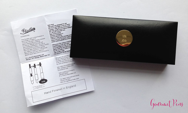
The Viper's Strike packaging is simple and straight forward - a clamshell case with a felt bed inside. The outside has a metal plaque to indicate the nib is gold. It's a cute touch. Nothing fancy about it.
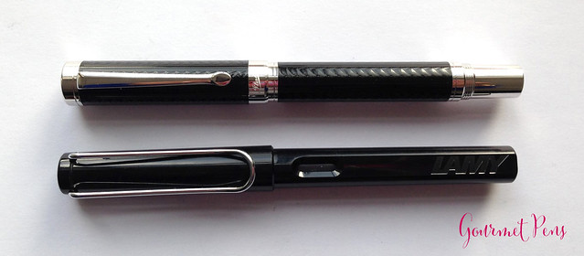
Mr.Pen Italix Viper Strike Fountain Pen - 18KT Gold Medium (3)
APPEARANCE
Mr.Pen Italix Viper Strike Fountain Pen - 18KT Gold Medium (4)
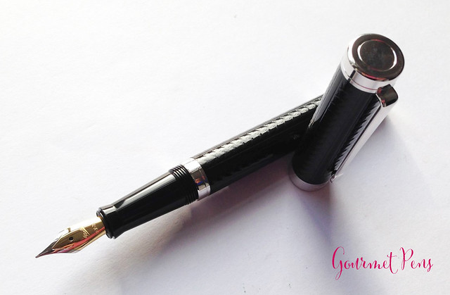
I can't say this is my favorite looking pen ever. It's simple and attractive - round and straight with blunt, flat ends. The finial is a shiny chrome top with a grooved ring in it. The clip is internally connected, starting just below the chrome top. It's a good-looking clip, matching the body's design well. It ends in an oval knob with a ball underneath it.

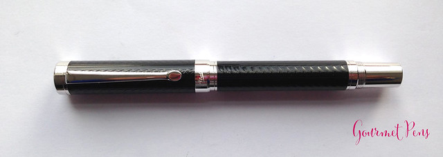
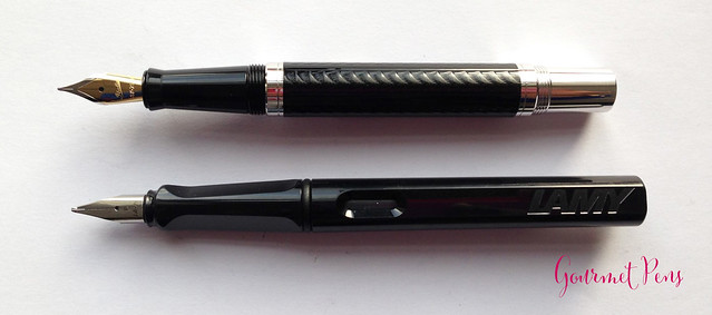
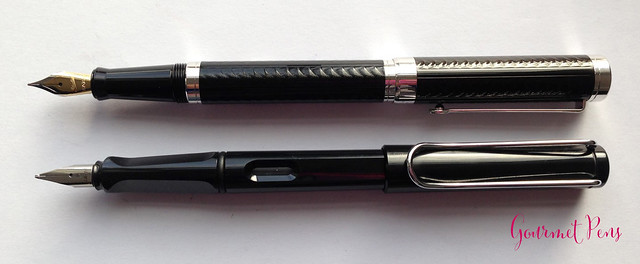
The center band is a wide chrome band marked with Italix. It connects to a thinner band on the barrel, making the whole center band look quite large. The end of the pen is also chrome, and this is where the threads for the cap give it that kit pen look. The section changes that kit pen look though, because it's definitely not kit pen shaped. It's smooth, black resin, tapering towards the nib, then flaring out to a smoothed ridge.
Mr.Pen Italix Viper Strike Fountain Pen - 18KT Gold Medium (11)
The barrel and cap have a glossy black carbon-fiber like pattern that is raised. The chrome trim is an attractive complement to the color and design. Overall, it's not an ugly pen, but the back end throws me off a little.
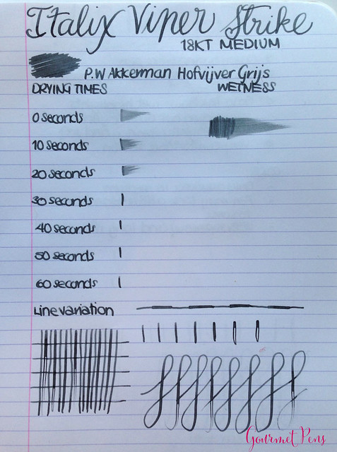
NIB & PERFORMANCE

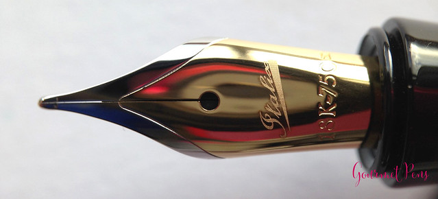
The #5 two-tone 18KT gold nib is quite pretty. It has a single slit and breather hole, and is marked with Italix and 18K-750, as well as (the only nib size it comes in) - medium.
Mr.Pen Italix Viper Strike Fountain Pen - 18KT Gold Medium (8)
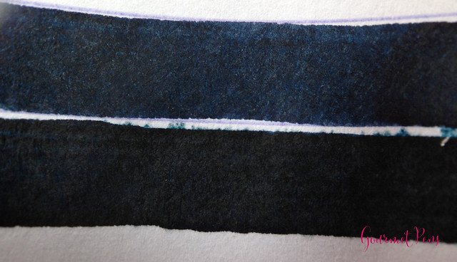
The nib was perfectly adjusted upon arrival. It was very smooth but not at all over polished - there were no skips or hard starts. It wrote consistently and reliable. I love that it was a soft nib so it offered a very pleasant, slightly yielding writing experience. The ink flow is good - it is slightly on the wet side. Overall, a lovely performer.
Mr.Pen Italix Viper Strike Fountain Pen - 18KT Gold Medium (14)
With some pressure, some line variation is possible, but it dried out quickly. Therefore, it was ideal to just stick to enjoying the nib for its softness and not its spring.

IN HAND

The clip is very tight and hard - it's difficult to operate with one hand. I have found this to be the case with all the Italix pens I have used (two Parson's Essential, Churchman's Prescriptor, and the Captain's Commission), so if you rely on a clip, this could be a deal breaker. It could be slid on to a few pages and into pouches, but not without some effort.
Mr.Pen Italix Viper Strike Fountain Pen - 18KT Gold Medium (6)
Mr.Pen Italix Viper Strike Fountain Pen - 18KT Gold Medium (7)
Mr.Pen Italix Viper Strike Fountain Pen - 18KT Gold Medium (9)
The section is a nice, comfortable shape. The threads at the end are slightly sharp should you run your fingers over it, but the section itself is plenty large enough to hold.

Unposted, the section is not slippery but I find the pen fairly heavy and lacking a balance point that works for me. It's not unusable, but I don't find it particularly comfortable. The cap posts by threading, which helps to remove that kit pen look, but it doesn't post very deeply. As such, the pen becomes quite long and way too top heavy for me.
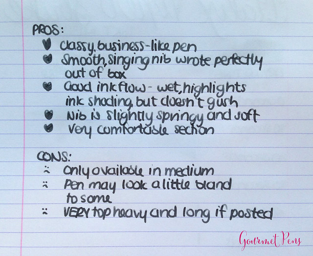
PROS & CONS
Mr.Pen Italix Viper Strike Fountain Pen - 18KT Gold Medium (15)
OVERALL

The Italix Viper's Strike is a substantial, robust pen with a really pleasant nib. I'm not crazy about the design because it looks a little like a kit pen, but it's not unattractive. The nib though! Really, it's excellent - smooth, wet, soft, and reliable. I thoroughly enjoy it and have actually put it on my Parson's Essential (which is a more comfortable size for me) when I want to change up the broad italic that is otherwise on there. Lovely combination!

I received this pen free of charge for the purposes of this review. I was not compensated monetarily for my review. Everything you've read here is my own opinion. There are no affiliate links in this review.

Wednesday, August 26, 2015

Wordless Wednesday

Wordless Wednesday

Tuesday, August 25, 2015

Ink Shot Review: Noodler's Van Gogh Starry Night @CarolLuxury

Thank you to an awesome reader for sending this sample to me! (Along with several other very special ones!)
Ink Shot Review Noodler's Van Gogh Starry Night Ink Review @CarolLuxury (6)
ABOUT

Ink Shot Review Noodler's Van Gogh Starry Night Ink Review @CarolLuxury (2)
Color: Blue-Black
Bottle: 3 oz/90 ml
Price: $12.00USD
Where to buy: FPN (may be sold out)
Ink Shot Review Noodler's Van Gogh Starry Night Ink Review @CarolLuxury (1)
Ink Shot Review Noodler's Van Gogh Starry Night Ink Review @CarolLuxury (3)
Ink Shot Review Noodler's Van Gogh Starry Night Ink Review @CarolLuxury (4)
Ink Shot Review Noodler's Van Gogh Starry Night Ink Review @CarolLuxury (5)
PROS
  • Gorgeous, dark ink. 
  • Fantastic name, obviously.
  • Color shifts a little but has some water resistance.
Ink Shot Review Noodler's Van Gogh Starry Night Ink Review @CarolLuxury (7)
CONS
  • An FPN exclusive, so hard to get.
  • Little shading.
OVERALL

Actually, this is pretty gorgeous. I really like it and it's close to Sailor Bungbox 4B, which I really like.

Monday, August 24, 2015

Review: Versanote Journal @mobolifestyle

Review Versanote Journal @mobolifestyle (1)
ABOUT

Size: Medium
Color: Pink & Ivory
Ruling: See below - grid, lined, combo
Page Count: 160
Price: $16.00USD
Where to buy: MoboLifestyle
Review Versanote Journal @mobolifestyle (7)
APPEARANCE

The Versanote is a simple notebook. Mine is the Raspberry Pink journal, with a raspberry pink cover, obviously. The cover is firm, with a matching pink elastic closure and bookmark. The bookmark is satiny and thin. The cover has rounded edges and is debossed with VERSA NOTE. The paper inside is hand-stitched in signatures, also with rounded corners.

The inside cover has a spot to write your name, info, etc. There is a page with note-taking tips, which I think was quite useful and gave me some great ideas.
Review Versanote Journal @mobolifestyle (4)
Then the notebook starts! The paper is ivory with a very interesting ruling. At the back of the notebook, there is a pocket. That's all there is to it.
Review Versanote Journal @mobolifestyle (5)
PERFORMANCE & FEEL

I love the feeling and texture of the cover. It's a faux leather that resists water. It's not squishy (for you squishy hardcover haters!), but is soft to the touch. It's held up really well to much use - being tossed in my bag, having keys and machined pens gouge it, and being dropped. It still looks pretty good; not pristine, but classy and used. I really like that.

The notebook is hand made (hand stitched). The paper it came with says this, and that it may not be error-free. If you find an error, Mobo requests you let them know. I think that's pretty cool. I have scoured my notebook thoroughly for errors that may bug me, but I haven't found any actual errors.
Review Versanote Journal @mobolifestyle (2)
The paper feels smooth but not slick. It's advertised to be fountain pen resistant and blotch proof - smart choice of words, because it's not completely fountain pen-friendly. More on that soon.

Pencils were great - it felt like I was actually sketching. The paper isn't so slick that the pencil just glides across the paper. My pencils, even the ones with light lead, gave solid, legible lines. Ballpoints, gel pens, marker pens, a nd artist pens were great as well. Even roller balls worked. Show through was almost non existent, and only wet roller balls showed a little. Brush pens were a lot of fun because they dried fast, did not feather, and didn't bleed.
Review Versanote Journal @mobolifestyle (10)
Review Versanote Journal @mobolifestyle (16)
Fountain pens are fun to use because the paper gives some feedback (since it's not really slick), and I actually enjoy that when I'm practicing my handwriting. It also helps me keep my writing consistent. I experienced almost no feathering with normal writing, but a little bit of ghosting with wet writers. There was some bleed through though - so the paper is fountain pen resistant, but not ink proof.
Review Versanote Journal @mobolifestyle (17)
Particles were visible, shading was toned down, and sheen was toned down either completely or quite a bit. Flex nibs seem to be too wet to use - bleed through and ghosting became too frequent. Drying times were pretty fast.
Review Versanote Journal @mobolifestyle (9)
Review Versanote Journal @mobolifestyle (13)
I can't really draw, but I love the idea that you can use this notebook/paper either in portrait or landscape. The grid ruling has three sections and a regular lined ruling. Once you decide what you want to do with the paper, the ruling you want becomes clear. That sounds weird, but it works! If you want to write, the sections divide as you write. If you want to sketch, you can start and the grid is obvious. It's neat.
Review Versanote Journal @mobolifestyle (14)
Review Versanote Journal @mobolifestyle (15)
Image credit: Mobolifestyle
The perforated pages tore out easily and it was really clean, and the notebook opened completely and it lies flat. Great stuff.
Review Versanote Journal @mobolifestyle (6)
PROS
Review Versanote Journal @mobolifestyle (11)
CONS  
Review Versanote Journal @mobolifestyle (12)
Review Versanote Journal @mobolifestyle (8)
OVERALL 

I'd pick this over a Moleskine any day. I love the ruling, I love that it lies flat, I love that all the pages are perforated, and I have filled up half the notebook already because I enjoy writing in it so much. (Also, trying to draw in it.) Fantastic. More colors and special covers like what Moleskine offers could knock Moleskine out!
Review Versanote Journal @mobolifestyle (3)
I received this item free of charge for the purposes of this review. I was not compensated monetarily for my review. Everything you've read here is my own opinion. 
Related Posts Plugin for WordPress, Blogger...
 
Creative Commons License
GourmetPens by Azizah Asgarali is licensed under a Creative Commons Attribution-NonCommercial-NoDerivs 3.0 Unported License.
Based on a work at http://www.gourmetpens.com.
COPYRIGHT©2010-2024