Showing posts with label office supplies. Show all posts

Friday, June 17, 2022

Diplomat Aero Flame Fountain Pens - 14kt Gold Nibs Extra fine, Fine, Medium, Broad

Diplomat Aero Fountain Pen Flame 14kt Gold Nibs

A huge thank you to Diplomat Pens Canada for providing these pens so I could share them with you! I've been giving them a hardcore run for the last few months. You can find them at your favorite Diplomat retailer!


If you enjoy and/or appreciate and you want to lend your continued support, please do check me out on Patreon. You can pledge your support and/or undying love for as little as $1. You are in no way obligated to do so. I appreciate your readership, viewership, and your support so much - thank you! 

Tuesday, September 28, 2021

Caran d'Ache 849 Rollerball Pen

Caran d’Ache 849 Rollerball Pen

The new Caran d'Ache 849 rollerball pen! A jumboish version of the regular ballpoint we know and love! I bought mine at Take Note Store in Toronto.


If you enjoy and/or appreciate and you want to lend your continued support, please do check me out on Patreon. You can pledge your support and/or undying love for as little as $1. You are in no way obligated to do so. I appreciate your readership, viewership, and your support so much - thank you! 

Friday, April 30, 2021

Stanford Wood Studio Inspired by The Impressionists Fountain Pen | Exclusive Ink | Pouch

 Stanford Wood Studio The Impressionist Fountain Pen

Thank you, Stanford Wood Studio, for sending this lovely package for me to check out and share with you. I was not compensated monetarily; the goal is to share the crowdfunding campaign with you and give you a preview of the rewards. They're pretty awesome, and I am honoured. 

Please do visit the Thundafund campaign and check out the pledges and rewards!


If you enjoy and/or appreciate and you want to lend your continued support, please do check me out on Patreon. You can pledge your support and/or undying love for as little as $1. You are in no way obligated to do so. I appreciate your readership, viewership, and your support so much - thank you! 

The P.W. Akkerman x Gourmet Pens Pink Ink Collaboration:
Need some more PINK in your life?

/ᐠ。ꞈ。ᐟ\*ᵖᵘʳʳ*

P.W. Akkerman
Vanness Pens
Lemur Ink
Bookbinders Design
Laywine's (call or email)

Tuesday, November 10, 2020

Handwriting with a TWSBI Diamond 580 Rose Gold II Fountain Pen with an Extra-Fine Nib

A short, innocent visit to Phidon Pens in Cambridge, Ontario led to this video! I mean there are things in between such as Fountain Pen Day (well, weekend. MONTH, as it should be.) and picking a TWSBI to share with you. My thanks to Phidon Pens for providing this EF beauty - extra-fine because it's beautiful and I love rose gold and clear pens and extra-fine because it's an EF nib. For real. Check out their TWSBI selection here, including the new Iris 700R or this Rose Gold piston-filler.

 Handwriting with a TWSBI Diamond 580 Rose Gold II Fountain Pen - with an Extra-Fine Nib

Music: YouTube Audio library
No Starlight Dey Beat - Nana Kwabena


The P.W. Akkerman x Gourmet Pens Pink Ink Collaboration:
Need some more PINK in your life?

/ᐠ。ꞈ。ᐟ\*ᵖᵘʳʳ*

P.W. Akkerman
Vanness Pens
Lemur Ink
Bookbinders Design
Laywine's (call or email)

Oh. Also. I received this free of charge so I could share my thoughts with you and do fun things with it. I hope this has been helpful and thank you for watching. If you enjoy and/or appreciate and you want to lend your continued support, please do check me out on Patreon. You can pledge your support and/or undying love for as little as $1. You are in no way obligated to do so, of course. I appreciate your readership/viewership and your support so much, so thank you! 


Tuesday, September 15, 2020

Louis Vuitton Rouge Libertin Ink

I remember the first time I heard Louis Vuitton had fountain pen ink, I chuckled to myself because I was 100% sure there was no way I would be willing and able to spend $52 on a bottle of fountain pen ink. A generous reader sent me a sample of Bleu Rêveur and I did a review of it - way back in 2015! Looking back at that review, I also cringe at my handwriting but I guess that's part of the journey.

These bottles are very much like the Caran d'Ache Colors of the Earth bottles with their square shape and heavy glass base. I really like how stable they are because there's no way I want to knock this bottle over while filling my pen because I'll be sucking it off my desk with a pipette to return to the bottle. Or my mouth in desperation if there is no pipette nearby. When it was released, it was basically $1/ml so it's probably the most expensive 50 ml of ink I have. I have several of these LV inks to check out and share now because I borrowed them from a friend so while they are not my inks, its still fun for me. Hopefully it'll be fun for you, too!

Louis Vuitton Rouge Libertin Ink 1

The box is very light and elegant and I really like the simple, clean branding and label. The bottles all match each other with all their labels being just as clean and tidy. I love how they match when they're all lined up. The bottles have wide mouths and are easy to fill from. I have not reached the halfway point in the bottle and I imagine when the ink level is lower, it'll be harder to fill big nibs from but for now there are no issues. Eventually I'll have to switch to just inking the cartridge or using a syringe to fill a converter/piston/eyedropper. This is not a deal breaker for me. A little dip in the base of the bottle would make it easy to get to every last drop.

Louis Vuitton Rouge Libertin Ink 2

Mmmm that red! It's a gorgeous deep red with medium saturation so it still can show some shading. There is no shiny sheen, rather the saturated spots dry down to a matte red. Rouge libertin, or libertine red, is a very interesting name. Obviously it's red. Wikipedia says a libertine is, "A libertine is one devoid of most moral principles, a sense of responsibility, or sexual restraints, which are seen as unnecessary or undesirable, especially one who ignores or even spurns accepted morals and forms of behaviour sanctified by the larger society. Libertinism is described as an extreme form of hedonism."

It gets better. Oxford's definitions are as follows: 

Noun: libertine
1. a person, especially a man, who behaves without moral principles or a sense of responsibility, especially in sexual matters.
Similar: philanderer, ladies' man, playboy, rake, roué

2. a person who rejects accepted opinions in matters of religion; a freethinker.

Adjective: libertine
1. characterized by a disregard of morality, especially in sexual matters. "his more libertine impulses"
Similar: licentious, lustful, libidinous, lecherous, lascivious, lubricious

2. freethinking in matters of religion.

Late Middle English (denoting a freed slave or the son of one): from Latin libertinus ‘freedman’, from liber ‘free’. In the mid 16th century, imitating French libertin, the term denoted a member of any of various antinomian sects in France; hence libertine (sense 2 of the noun).

Well, that certainly gives one something to think about. I remember seeing a bottle of shiraz from McLaren Vale called The Hedonist and the color certainly makes me think of this ink. I'm clearly overthinking this but it's part of the fun of inks with interesting names.

It's a little on the dry side but I have no issues with its flow when writing. It's well-behaved - easy to clean because it's not super saturated, performs well on various papers although I really only use fountain pen friendly paper like Rhodia, Clairefontaine, Tomoe River, Midori, and Maruman, and the I like the color a lot. My go-to red is Montblanc Corn Poppy Red but now that it's discontinued, I'm expanding my palette a little. I'm happy to say Rouge Libertin falls into the true red category for me - not orangey red, thank goodness! - because that's what I want in my reds.

I'm just having fun with my inks as of late and it's been a nice spark of excitement for me in the hobby.

Louis Vuitton Rouge Libertin Ink 3Louis Vuitton Rouge Libertin Ink 4

Pen: Esterbrook JR in Carmine Red + medium steel nib
Paper: Tomoe River

Louis Vuitton Rouge Libertin Ink 5

I hope this has been helpful. Thank you for reading. If you enjoy and/or appreciate this type of information and you want to lend your continued support, please do check me out on Patreon. You can pledge your support for as little as $1. You are in no way obligated to do so, of course. I appreciate your readership and your support so much, so thank you! 

Tuesday, September 8, 2020

Esterbrook JR Fountain Pen - A New Take on the Vintage Esterbrook J

Esterbrook brings us a new fountain pen, inspired by (inarguably?) one of the most popular vintage pens: the Esterbrook J! At the same time, we have the new Esterbrook Nook in navy blue with a soft red interior, a button closure, and an elastic to keep the pens in place. It's pretty great - it serves well as a case to carry pens but also as a display or holder while working at your desk. I love the soft interior and I really, really appreciate the elastic. Why? I have a similar Visconti zippered pen case and if you ever forget that it's open and you pick it up, all the pens fall out. This has happened many times, unfortunately. It's always followed by a panicked scramble to grab them as they fall and then curse myself for forgetting. Again. 

Esterbrook JR Fountain Pen - A New Take on the Vintage Esterbrook J  18Esterbrook JR Fountain Pen - A New Take on the Vintage Esterbrook J  1Esterbrook JR Fountain Pen - A New Take on the Vintage Esterbrook J  17


Esterbrook introduces their modern take on the famous Esterbrook J series fountain pen: the new JR shares the shape and design of the clip save for the engraving, the look of the marbled material, the streamlined cap and barrel, the Estie cap band, and a steel nib. Unlike the vintage J which fills by a lever, the new JR fills by cartridge/converter - easy peasy to clean and maintain. My Carmine red wrote well out of box - nice, smooth, reliable. The section is really comfortable and the pen feels good and balanced in hand! It does share the smaller size, which is quite different than something like the Estie Oversize! I appreciate this option because as my nerves in my arm/shoulder get inflamed, having a light pen that is easy to write with for longer sessions is a relief. ⁣

Esterbrook JR Fountain Pen - A New Take on the Vintage Esterbrook J  5Esterbrook JR Fountain Pen - A New Take on the Vintage Esterbrook J  6Esterbrook JR Fountain Pen - A New Take on the Vintage Esterbrook J  7Esterbrook JR Fountain Pen - A New Take on the Vintage Esterbrook J  8

Like many vintage pens, the JR is a smaller pen. Compared to the Camden Composition, the Estie Oversize, Estie Regular, and Estie Slim, it is still smaller than all of them. It is also slimmer, so I do believe they have remained true to the vintage feel of the pen. 

Esterbrook JR Fountain Pen - A New Take on the Vintage Esterbrook J  10Esterbrook JR Fountain Pen - A New Take on the Vintage Esterbrook J  11Esterbrook JR Fountain Pen - A New Take on the Vintage Esterbrook J  12

Esterbrook JR Fountain Pen - A New Take on the Vintage Esterbrook J  13

I think it's a great option for smaller hands and serial posters! I used to be comfortable writing with larger, heavier pens all of the time until I hurt my nerves/tendons in my right (writing) arm. Since then, I have been struggling with weakness and a shaky hand so the lighter, smaller pens have actually been moving into my rotation more often. As such, the JR is super comfortable for me and easy to control. In addition, the #5 nib is small and the section is shaped such that I can get my grip close to the nib. I have good control of the pen especially as it is balanced and light. I don't have to hold the pen tightly to control my penmanship with my shaky hand. It's been a journey to adapt to the weakness and shaking. It's frustrating. 

Esterbrook JR Fountain Pen - A New Take on the Vintage Esterbrook J  14Esterbrook JR Fountain Pen - A New Take on the Vintage Esterbrook J  15

A common question is, what nib size should I start with? If you can't try different sizes in person, you could always start with a broad and have it ground by a nibmeister - like at Toronto Pen Company - or you can just take the middle road with a medium nib. The medium on the Esterbrook JR is a nice, smooth steel nib. It serves well as a daily writer because it's not super wet and it's firm enough to withstand a heavy hand. It's a super comfortable pen. The section fits into my grip really well and I can get nice and close to the page for the best control for my shaky hand.

Esterbrook JR Fountain Pen - A New Take on the Vintage Esterbrook J  9

Esterbrook JR Fountain Pen - A New Take on the Vintage Esterbrook J  3Esterbrook JR Fountain Pen - A New Take on the Vintage Esterbrook J  4

How does the JR stand out from other fountain pens? I believe the size is interesting, aside from the smooth nib and cute colors (there is a black and blue as well). It's a full size, postable pen without being a pocket pen. There are so many huge, heavy pens on the market - not knocking them, I have some of them! - and there are certainly other smaller pens out there but the JR brings another option to the table. It is extra appealing if you enjoy remakes of classics!

Esterbrook JR Fountain Pen - A New Take on the Vintage Esterbrook J  16

Thank you to Esterbrook for providing their brand new JR for me to check out and share with you. I received this pen free of charge so I could share my thoughts with you. I hope this has been helpful. Thank you for reading. If you enjoy and/or appreciate this type of information and you want to lend your support, please do check me out on Patreon! You can support yours truly for as little as $1. You are in no way obligated to do so, of course. I am most grateful for your readership as is.

Tuesday, September 1, 2020

Baron Fig Squire Adrift Rollerball

Baron Fig Squire Adrift Rollerball 9

Create an ocean of ideas with Adrift — a Squire Rollerball that features a full wraparound design inspired by the world beneath the waves.⁣

An ocean of ideas.⁣

Putting an idea on paper is like sending a letter out to sea—there’s no knowing where it will end up. Set your ideas adrift and discover the treasures they bring.⁣

An endless sea.⁣

Adrift is the first Squire Rollerball Limited Edition to feature a full wraparound design. Seek uncharted waters with this stylish blue pen in hand.⁣

⁣A deep dive into creativity.⁣

Every seafarer needs a companion, like every pen needs its other half. Adrift pairs swimmingly with our Confidant and Vanguard notebooks." - Baron Fig

⁣Adrift is Baron Fig's most recent limited edition Squire rollerball. Unfortunately because of postal delays, this edition sold out just days after I received it. I posted about it recently on Instagram, where I usually post snippets and previews but I wanted to expand a little on my thoughts there. 

It's not a fountain pen, it's true, and I still love it. I'm a water baby. Everything water makes me happy. Swimming is one of my favorite sports and the ocean is captivating. Tiny cute doodles make me smile so this perfectly blue pen adorned with wee cuties was just the bright spot I needed. I get to zone out and doodle, (attempt to) draw, and write out some of the thoughts that had me sinking a beneath the surface. ⁣

⁣One of things Baron Fig does really well is the presentation of the Squire. In this case, it's a message-in-a-bottle-theme and it even has a little message in the tube! The tubes are cute enough to keep and they are not huge or cumbersome. The only downside is when they are empty, they are quite light and can tip over.

Baron Fig Squire Adrift Rollerball 1Baron Fig Squire Adrift Rollerball 2

This one comes with a brain teaser that will send you into a world of - rolling waves? 

Baron Fig Squire Adrift Rollerball 3Baron Fig Squire Adrift Rollerball 4

This limited edition is based on the Squire - it has an aluminum body that weighs in at 0.85 oz and takes a cartridge refill. It's precision weighted and has an ergonomic shape. Indeed, it is very comfy to hold and write with and the refill is smooth and dark. The ink has great coverage and doesn't wash away completely with water. I used a water brush to swipe across the writing a few times and the ink stuck around but it might not survive a soaking. Your paper probably won't survive much of that, either. 

Baron Fig Squire Adrift Rollerball 5Baron Fig Squire Adrift Rollerball 6Baron Fig Squire Adrift Rollerball 7Baron Fig Squire Adrift Rollerball 8

The Adrift has these adorable marine graphics and again, as a water baby, it makes me really happy. It's sweet and happy and the blue is a gorgeous deep sea blue with a brushed metallic finish. It's smooth and satiny to the touch. The back of the pen has the little knob to extend and retract the refill and you also unscrew it to pop in a new refill. Sometimes I turn it the wrong way too far and open it up but that's just because I never remember things. Since it's so round and sleek, it rolls and it slides. Best to tuck it into a sheath or a closed case because it can very easily slide out of your pocket or roll off a desk. If you're jotting notes and putting your pen down in between doing something else, that's where it can quickly roll away.

I know a few friends who wouldn't consider a rollerball that costs more than $10 and that's ok! To each their own. The Squire is a great gift idea, they perform really well, and they could be collected if that's your thing. 

They are clearly slender so if you have trouble gripping slim pens, Adrift might be uncomfortable. As it is fairly light, it otherwise works well for longer writing sessions. 

Baron Fig Squire Adrift Rollerball 10Baron Fig Squire Adrift Rollerball 11

The Squire Adrift sold for $60USD and unfortunately, this limited edition is sold out. The regular line up is always available and keep an eye out for their next release!

Thank you to Baron Fig for providing this pen. I received this pen free of charge so I could share my thoughts with you. I hope this has been helpful! Thank you for reading. If you enjoy and/or appreciate this type of information and you want to lend your support, please do check me out on Patreon! You can support yours truly for as little as $1. You are in no way obligated to do so, of course. I am most grateful for your readership as is.

Tuesday, July 14, 2020

Blackwing Volume 3 The Ravi Shankar Pencil

Should you get them? Yes!

The latest Blackwing Volumes pencil for June 2020 is the tribute to Ravi Shankar. If you know my preferences, you'll already know I was attracted to them because of the perfect yellow color! There's more to them, of course.
Blackwing Volume 3 Ravi Shankar 4
Om - waking, dream, and unconscious states of being.  That could be a journal prompt!
Blackwing Volume 3 Ravi Shankar 9
A tribute to the Godfather of World Music.

In June of 1966, George Harrison met maestro Ravi Shankar in Bath, England. Harrison asked Ravi to teach him how to play the sitar, a task Ravi agreed to only after considerable hesitation. Their collaboration resulted in an explosion in the popularity of classical Indian music and instrumentation in the United States and around the world.

Harrison called Ravi “The Godfather of World Music.” Trained in both traditional Hindustani music and classical European theater, Ravi was an artistic genius who influenced countless artists around the world. He infused structure and spectacle into Indian instrumental music and introduced the West to Indian traditions like meditation. He was a true ambassador of India’s rich culture of mindfulness that extended well beyond the stage.

The Blackwing 3 is a tribute to Ravi Shankar on his 100th birthday. It features a matte turmeric finish accented with a pattern inspired by one of Ravi’s iconic sitars. The pattern prominently features the ॐ (Om), a sacred Sanskrit symbol with three phonetic components that correlate to the waking, dream, and unconscious states of being. The Om was an important symbol to Ravi, and served as a constant reminder of the contemplative, spiritual nature of his music. Translated from Hindi, Ravi means “sun,” and this pencil’s gold imprint and ferrule are a meditation on the light he brought into the world through his music and spirit.

We’re excited to announce that a portion of every pack sold will benefit the Ravi Shankar Foundation and their mission to “preserve the diversity of cultures and richness of their arts.” Learn more at RaviShankar.org. - Blackwing
Blackwing Volume 3 Ravi Shankar 6
I didn't even know Blackwing supports different foundations in accordance with the pencil's tribute. That's a beautiful initiative and certainly adds that little something special to sway me. If I needed swaying. Which I don't. But if I did. If this is important to you, splurging on Blackwing pencils might be something that appeals to you and that you feel comfortable doing. If it is not something near and dear to your heart, no big deal either. I think it's one of those intangible touches Blackwing is really good at that makes me want to stick around and support them when I can.
Blackwing Volume 3 Ravi Shankar 8
I used to try to avoid getting stationery items that I would have to use up, like special notebooks, limited edition inks, stickers, and pencils. I'm pretty comfortable with things like refillable notebook covers, refillable pens, paper clips, and the like. However, in part of my "COVID19" learning, I am trying to let go of material items and just learn to enjoy things instead of holding on to them thinking that's best for me. Maybe it's best for someone else but I enjoy using these items, even though I know it will come to an end.
Blackwing Volume 3 Ravi Shankar 5
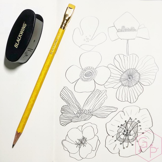
The turmeric yellow is so bright and happy and warm that it's worth it to me. Not only do they brighten up a picture, they brighten my desk! I have been using them to (attempt to) draw florals, which I find very satisfying even if they don't look quite like what they're supposed to. That's ok. It's a global pandemic and I'll draw poorly if I want to.⁣ I can't draw real things like kumquats and mushrooms and Link but I can draw lines and put them together and make them look like words and that is exactly why I love hand lettering. And I use this as an excuse to get pretty Blackwing 3 pencils as though I *need* them for my "creations". NEED.
Blackwing Volume 3 Ravi Shankar 3
I usually reach for the soft graphite pencils (like the classic black ones) so I only got three of these, thinking the extra-firm graphite would not be my favorite and would last me forever. Well, they're not nearly as firm as I expected them to be. They sharpen easily with the Blackwing Long Point sharpener and I imagine they wouldn't be troublesome with any other quality sharpener. I'm happy about that because I like how they perform. They're very nice for a slightly darker outline and then very light-handed shading/filling.
Blackwing Volume 3 Ravi Shankar 1
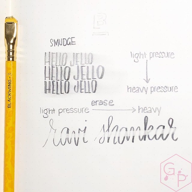
Other than attempting to draw, I am using them for hand lettering. Lettering is what I tend to use my pencils for in general but I wanted to get to know the extra-firm graphite a little better. I think the writing samples came out pretty well.
Blackwing Volume 3 Ravi Shankar 7
Blackwing Volume 3 Ravi Shankar 2
With one swipe of the eraser, it erases moderately well. Truly, a light hand gives more than enough legibility but sometimes you might want to change it up. A full eraser would certainly do a better job because you could scrub away a bit. Of course, the paper will affect the erasability and smudginess, too. I found it pretty smudgy when using a flatter piece of the tip. This works out well for hand lettering and my poor drawings. I thoroughly enjoy the graphite for practicing control in handwriting - light upstrokes, normal downstrokes. It's somewhat meditative for me, as all writing seems to be.

I have even started forcing myself to use the erasers. They're replaceable and convenient, so it seems stupid not to use them. They look pretty sad once they are nubbed down a little. They are not the best erasers ever but that's fine, they work in a pinch.

Are they worth the price? If you like pencils, sure, why not? Unless you need hoards of them, having a box of 12 or picking up one or two is not unreasonable. Yes, you will use them up eventually, but why not have something pretty?

If you are local, find yours at Take Note (which is where I found mine)!

Tuesday, July 7, 2020

Sailor's Sailor Ocean Blue Ink

Sailor's Sailor Ocean Blue Ink 9 
For the past 15 years, Sailor has been actively holding Ink Studio in-shop ink blending events all throughout Japan. These sought after events have always been a success with Japanese consumers lining up to have custom ink colors blended by their famed Sailor ink blender Osamu Ishimaru. To mark Sailor Ink Studio’s 15th year milestone - and to thank their loyal followers - Sailor will be releasing a special commemorative edition bottle ink – the Sailor’s sailor. This special edition bottle ink was originally intended to be sold solely within the Japanese domestic market, however Sailor has decided to extend the availability to North America as well. - Wonder Pens
Sailor's Sailor Ocean Blue Ink 10
Sailor's Sailor Ocean Blue Ink 15
Sailor's Ink Studio line comes in those tiny little bottles with crazy cool colors named after numbers, which is incredibly frustrating when there are 100 colors and you have to remember which ones you like (no. 1 - 100, basically). The names are numbers. They're beautiful, they're expensive, and I still want most of them. I have resigned myself to having four bottles in total. That might sound like a lot but it isn't when you consider most of my nibs write 1ml/minute.

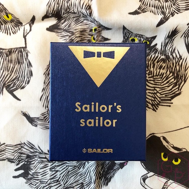
The Sailor’s Sailor Ocean Blue has some notable differences from the regular Ink Studio line up: the bottle is larger, it's not just a plain white box, the ink has a name, and in comparison to the bottles I own, the color is pretty chill. The solid little box is really cute and while I'm not usually someone who likes presentation, this one is well done and is not excessive. In fact, I'd keep the little box and I'd reuse this bottle for sure.
Sailor's Sailor Ocean Blue Ink 14
Sailor's Sailor Ocean Blue Ink 13
Sailor's Sailor Ocean Blue Ink 8
Sailor's Sailor Ocean Blue Ink 12
Sailor's Sailor Ocean Blue Ink 3
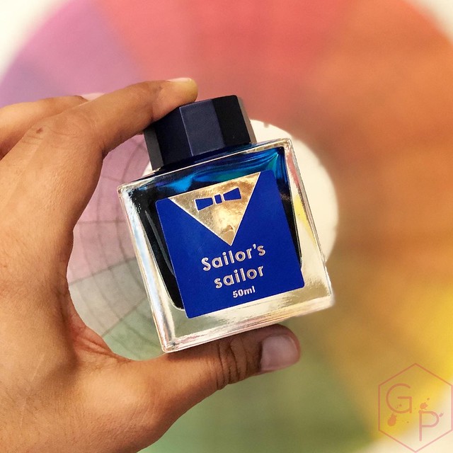
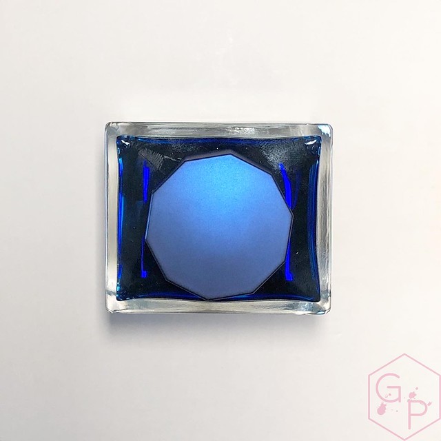
The bottle is solid clear glass and holds 50 ml of ink with a little blue label and gold bowtie. The cap is faceted and it's really easy to get a grip on and thus, open. It's a pretty matte metallic blue-purple that is sort of iridescent? It's hard to describe so you can check out the picture, but overall, the presentation is really nice. The bottle is pretty heavy and is very stable on the desk. It's easy to fill from and because it's stable, there is no risk of tipping.

Sailor's Sailor Ocean Blue Ink 5
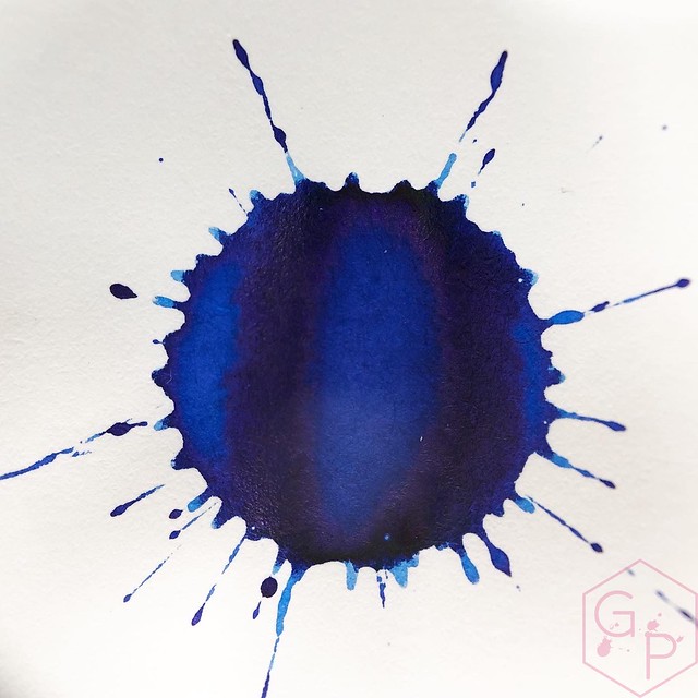
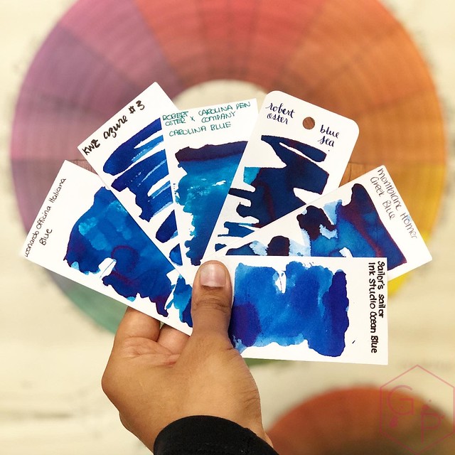
Ocean Blue is an attractive, vibrant, bright blue. I don't find it particularly unusual as far as blues go. It’s a lovely, very pure blue with medium sheen that matches the ink. I actually really like that.
Sailor's Sailor Ocean Blue Ink 4
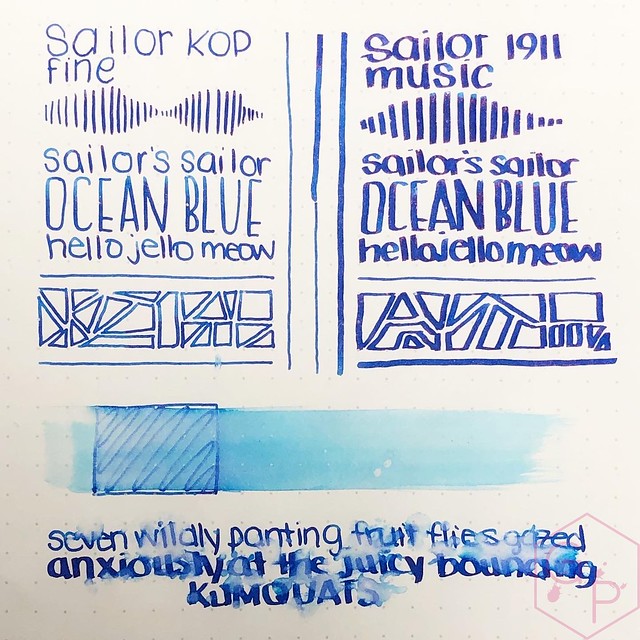
It’s unusual for Sailor to have an ink in the Studio line up that isn’t 3429234 colors in one. Sometimes you just want a pure color. It's definitely work appropriate and I don't think it is boring. It has a surprising amount of water resistance, which makes it even better. It's a clean color that is not super duper saturated so I have not found it difficult to clean. If you have greasy residue inside a clear pen (for example, from a piston), the blue can cling to the residue but I was able to clean it out using a Q-tip.
Sailor's Sailor Ocean Blue Ink 2
Sailor's Sailor Ocean Blue Ink 6
Here's where I can shock you: this is probably the first ink I've ever used where I actually prefer it in the fine nib I inked instead of the super wet juicy music nib. Why? The music nib is dare I say almost too wet and just floods the color out. The fine nib has medium flow so I could see the shading better and it has a strange ethereal delicacy to it, like you're writing on tracing paper. It's really interesting.
Sailor's Sailor Ocean Blue Ink 1
I wasn’t planning to get this ink but the bottle was cute and a friend asked if I wanted to split some (in other words, this sad soul bought the bottle and I said oh can I just borrow this for pictures? ... *siphons ink into sample vials*).  Do you need it? If you need another blue, absolutely. It’s a pretty decent one. If you have 29384029348 blues, I’d suggest sharing it with a friend. You’ll have to share custody of the really cute bottle. ⁣
Sailor's Sailor Ocean Blue Ink 7
Sailor's Sailor Ocean Blue Ink 11
$55CAD at Wonder Pens

Last but not least my friends, if you enjoy these posts and/or my videos and you would like to support me in some way, please check me out on Patreon!
Related Posts Plugin for WordPress, Blogger...
 
Creative Commons License
GourmetPens by Azizah Asgarali is licensed under a Creative Commons Attribution-NonCommercial-NoDerivs 3.0 Unported License.
Based on a work at http://www.gourmetpens.com.
COPYRIGHT©2010-2026