If you enjoy and/or appreciate it and you want to lend your continued support, please do check me out on Patreon. You can pledge your support and/or undying love for as little as $1. You are in no way obligated to do so. I appreciate your readership, viewership, and your support so much - thank you!
Ever since its release, the Montblanc Meisterstück Calligraphy 149 has been pretty exciting for those of us who love flexy writers. We all wanted to know: could Montblanc really get it right? I have used three of these pens: two from personal use and one tester at a Montblanc boutique. That means I have used only three out of however many are out there, so your miles may vary. If you'd like to see the full video, check it out here.
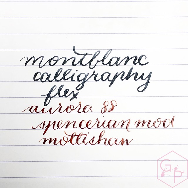
What I wanted to do here was compare the Montblanc Calligraphy nib with an Aurora 88 flex that has a Mottishaw (nibs.com) Spencerian modification on it. Before continuing with handwriting samples, I apologize in advance for my shaky writing. My hand has been unsteady for the last little while and it really shows up in hairlines.
MONTBLANC • ~ $1000USD - this is a heck of a purchase. It's a splurge and then some.
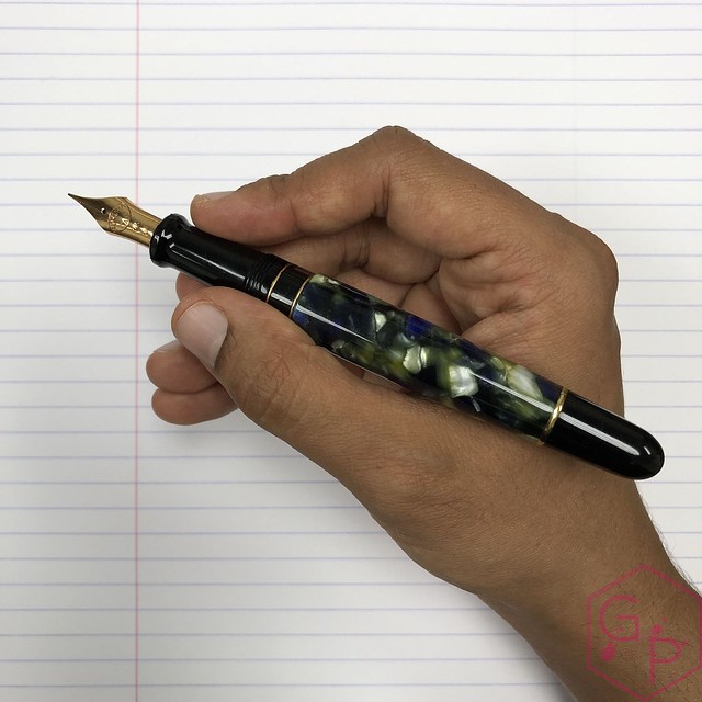
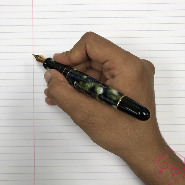
• Large, girthy pen. I find it quite thick in my grip so I don't have as much control over this pen as I do over something smaller - like the 146 or the Aurora. However, it is usable, but of all the nib options available on the 149, this one is the hardest for me to control.
• Without pressure, the nib puts down a Western fine. It's not an excessively wet nib but it performs well and ink flow is consistent.
• Fairly smooth writing experience overall. It's quite pleasant as a daily writer even if you choose not to use pressure. In fact, unless you have a particularly heavy hand, it can easy be used for regular writing.
• Moderate pressure gives you up to a double broad line - the softness feels like a super flex to me.
• It does not offer a whole lot of feedback when you are pushing it too far so you can railroad and run it dry. It also means it's easier to spring it so it takes some practice to get to know the nib. This is really the case for any pen with a soft nib but pay attention as you are writing and watch the tines. Look for how they're responding and if they're starting to develop a crease or something that indicates the metal is becoming fatigued.
• Snap back is a little slow but as a result, it's fairly easy to achieve smooth lines (unless you have my shaky hand).
• Line variation is decent but not Copperplate-type variation. The contrast is not super crisp.
The Spencerian starts from a semi-soft 14k nib and adds additional flex and a regrind to needlepoint to create a specialized writing point used for copperplate calligraphy.
• $585USD + $130USD for mod (also available on other less expensive pens, or equally expensive pens!)
• Pen size is likely more comfortable for most users. The section is nowhere near as thick as the Montblanc and because the nib is smaller, I can also get closer down, which gives me more control.
• Without pressure, puts down a Western extra extra-fine. It has been reground to be a needlepoint so you're really getting something precise.
• Sharp, crisp writing experience. It nears the realm of feeling scratchy and it requires a light hand. If you apply too much pressure, the nib can catch and make horrible sounds and do terrible things as you cross the page. Remember: very, very light hand. Never, ever apply pressure on the upstroke or cross stroke. When you apply pressure, make sure it is only on the downstroke and it's best to keep the tines aligned with the angle of your downstroke so the pressure is applied equally to both tines.
• Moderate pressure gives up to a generous broad - a little softer than the Montblanc
• Gives some feedback - nib starts to resist when you're pushing it too far. Ideally, you'd want to stop before this resistance so as to not damage nib. This nib needs to be treated with great care and attention. It's easy to spread the tines too far and even if they don't get sprung, you can inadvertently change the alignment or gap between the tines, which can make it write too wet. Your needlepoint won't be a needlepoint anymore!
• Snap back is fast so it requires careful control to achieve the variation and lines you want. The result is delicious.
• Nice, crisp line variation. The hairlines are exquisite and the contrast is outstanding.
I thoroughly enjoy both of these nibs. For ease of use and forgiveness, the Montblanc nib is a great choice. The major downsides are the price and the size of the pen. The Aurora (or any other option that can take the Spencerian modification) is likely to be a more usable size pen for most writers, it costs less, but it is more delicate and less forgiving. I think it's safe to say the Spencerian modification is for more experienced users. That's not to say a new fountain pen user can't use it; it just must be taken up with great care and attention.
The joys of "modern flex"! The honest truth is nothing compares to a dip nib in terms of flex, versatility, and cost but a flexy nib fountain pen is just so much fun! A good rule of thumb for flex nibs: never, ever apply pressure on the upstroke or cross stroke. When you apply pressure, make sure it is only on the downstroke and it's best to keep the tines aligned with the angle of your downstroke so the pressure is applied equally to both tines.
Where to buy? I purchased myMontblanc Meisterstück 149 Calligraphy flex pen at Appelboom. The Aurora is on loan from a friend but you can get an appropriate pen for the Spencerian grind by visiting this page and seeing your options. I hope this has been helpful! Thank you for reading. If you enjoy and/or appreciate this type of information and you want to lend your support, please do check me out on Patreon! You can support yours truly for as little as $1. You are in no way obligated to do so, of course. I am most grateful for your readership as is.
I purchased this pen from Appelboom some time ago and because I special ordered the double-broad nib, it took a bit more time because they had to send it back to Aurora for a nib swap. I take the pen for a twirl in the video! Enjoy!
Remember you can use the discount code 'friend' for 10% off your purchase at Appelboom! No commission, just a sweet deal for you.
Thank you to Appelboom for loaning me this Aurora Alpha Sky Blue fountain pen to review! If you'd like, you can use the code 'friend' at Appelboom for 10% off your purchase - excludes Montblanc, though.
I special ordered my Aurora 88 Urano quite some time ago from Appelboom. Thanks to Appelboom for the super fast nib order and getting it out to me safely.
Discount code for 10% off your purchases at Appelboom: 'friend'
Thanks to Iguana Sell for lending me this pen for a review! I have reviewed a different nib but it was so long ago that I figured a full review wouldn't be a bad thing.
ABOUT
Body material: Resin
Trim: Rose Gold
Cap: Screw on
Posts: Yes, friction
Nib material: 14 kt gold, rose gold plated
Filling system: Piston-filler
Length (capped): 135.9 mm/5.35"
Length (uncapped): 129.2 mm/5.08"
Length (posted): 155.0 mm/6.10"
Diameter (barrel): 12.2 - 13.9 mm/0.48" - 0.54"
Diameter (section): 10.5 - 11.8 mm/0.41" - 0.46"
Weight (all): 22 g
Weight (cap): 6 g
Weight (body): 16 g
Price: $515.00 USD
Where to buy: Iguana Sell
PACKAGING
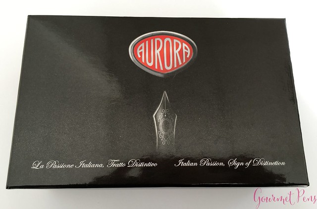
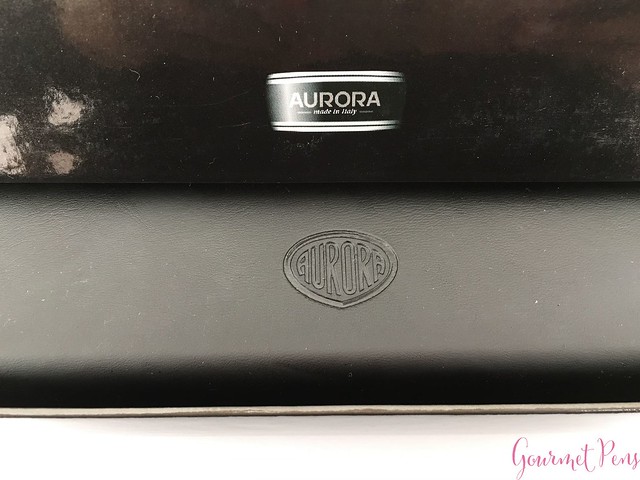
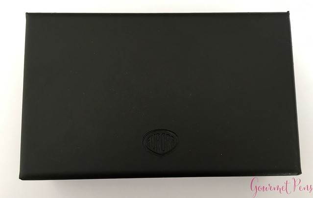
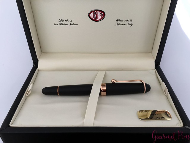
The Aurora 88 is presented in a large black clamshell box with an Aurora-branded outer cardboard box. The side of the outer box has the nib and pen details. The clamshell box has a leathery feeling to it and has the Aurora logo on top. The inside is a cream colored leather-like material. The removable bed holds the pen in place. There is a small plaque on the bed that says:
Pennino oro massiccio
14 kt
Solid gold nib
There is an Aurora booklet under the bed with company details/history, pen information, instructions for best use, filling ink, etc. If you are new to fountain pens, this is worth reading through. There's a lot of box for this pen.
APPEARANCE
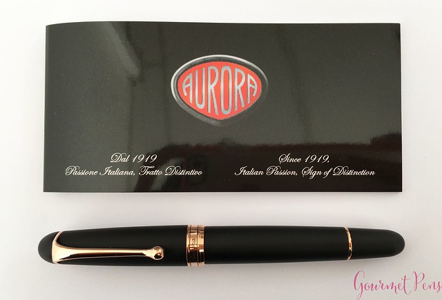
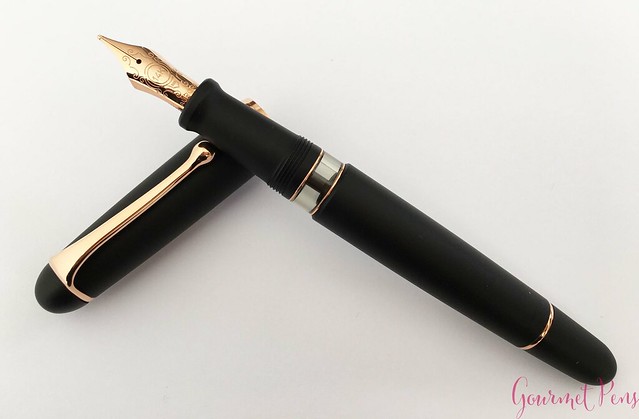
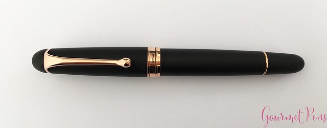
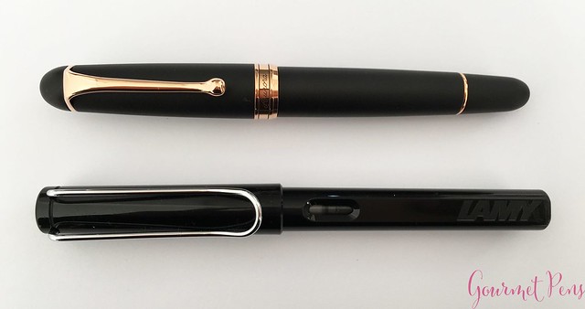
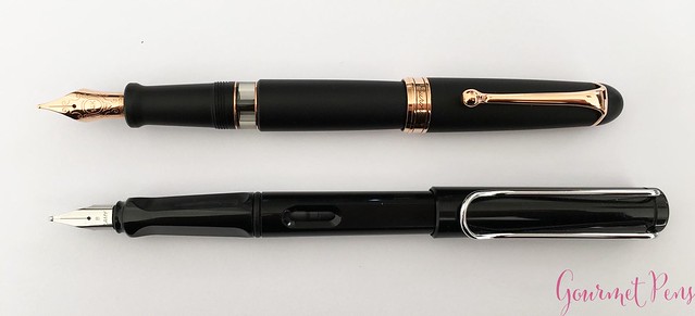
This is a good looking pen that ticks all the right boxes for me. It is a regular sized pen with a cigar shape - a round body with smoothly rounded off ends. The finial is a black satin dome but it is unmarked. The clip is attached to a metal ring around the top of the cap. I love the shape of the clip! It's smooth, curvy, and ends in a teardrop.
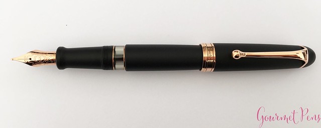
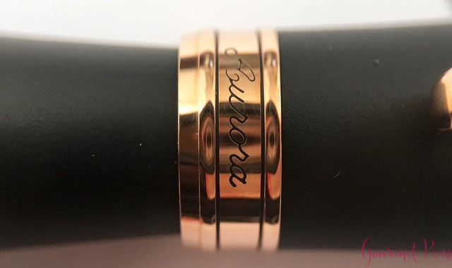
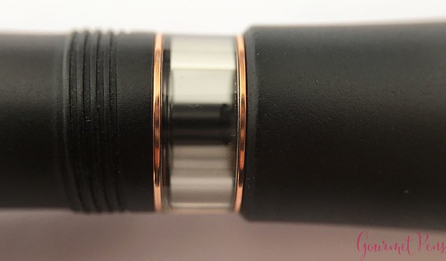
There is a center band located at the end of the cap. It is engraved with "Aurora" and has two thin black rings in it. It's a simple but attractive center band. There is also a thin metal band at the end of the piston-turning knob. The section is fairly long, tapering slightly towards the nib and ending in a flared ridge. There are resin threads at the back of the section, and a clear, double walled ink window. The ink window is not visible when the pen is capped, and the cap band connects smoothly with the barrel. The cap, section, and barrel are all black satin resin - black with a matte finish, that is. The clip, center band, and all other trim is a polished rose gold. I love the warmth of the rose gold against the matte black resin. The pen appears well finished and well made. I observed an evenly-spaced, very small gap between the finial and cap ring but that's about it. Minor detail because it looks like it was intentional.
One thing I really like about this satin black finish is the material holds up really well for regular use. It doesn't pick up or show micro scratches as easily as a polished resin pen so it looks its best for a long time!
NIB & PERFORMANCE
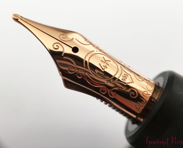
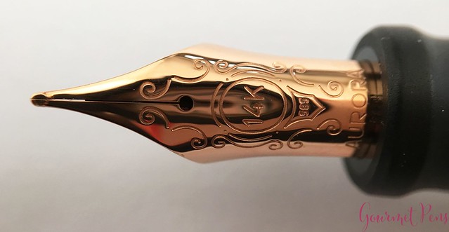
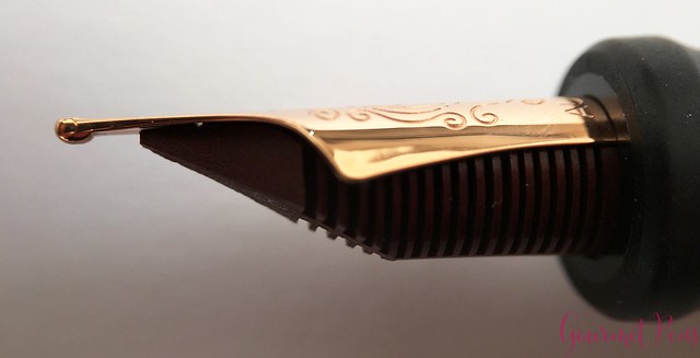
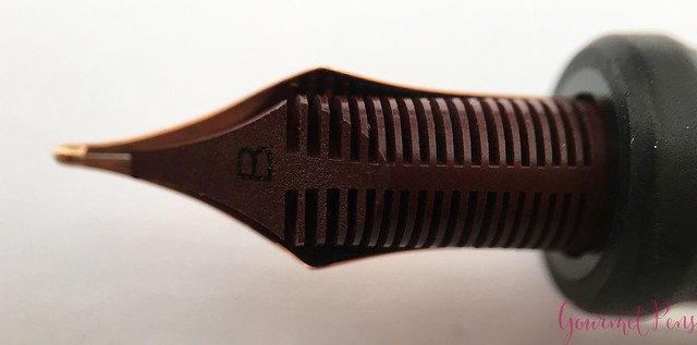
This nib is a solid 14 kt gold nib with rose gold plating, and an ebonite feed. The nib has a single slit, a round breather hole, and is engraved with some flourishes, 14 K, 585, and Aurora. The feed is dark red and has a B printed on it to indicate the nib width.
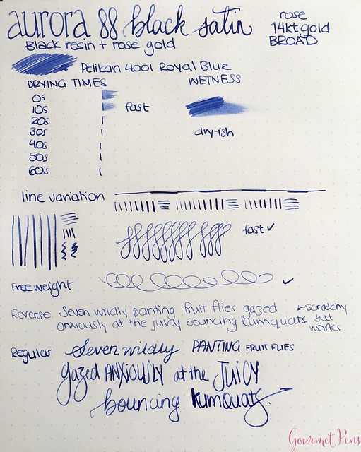
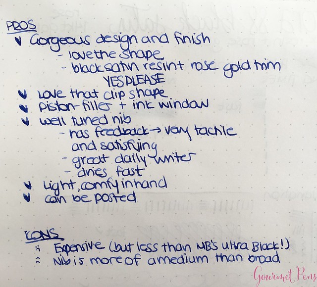
The nib performs quite well and its only real downside is that it writes finer than I would expect from a broad nib! It offers a fair amount of feedback that feels like writing with a pencil. It's not at all scratchy but you can definitely feel the nib on the paper. I actually like that feeling and it's different from most of my super-smooth nibs. Drying times with this nib are quite fast and it's not a gusher. Ideal for daily writing, note taking, journaling, etc. The nib is firm and does not yield much when writing. You can squeeze out a little line variation with pressure but I don't think it's ideal for this pen. The feed keeps up well with fast writing
IN HAND
The clip is snug but it can be lifted. The teardrop ball at the end is angled underneath so it can be slid on and off papers, pockets, and pouches. It's tight enough to hold the pen in place as well. The piston-filling mechanism has an interesting design - a hollow piston that houses some extra ink. It's great if you run out of ink but requires some attention when you're cleaning.
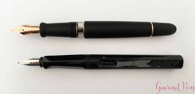
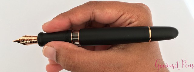
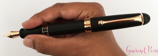
Unposted, the pen has a comfortable length and is on the light side. It feels well balanced. I think if you have larger hands, you'll have to post it to give it more length. The cap can be posted snugly by friction and it gives the pen a bit more weight and length, which feels right and more comfortable for me. I love that it isn't a super heavy metal body. It's lighter and doesn't tire out my hand.
PROS & CONS
OVERALL
Another beauty from Aurora. I'm a rose gold person - I know it's all in and trendy right now, but for me, it works. I love the black and rose gold theme and the shape of the pen is elegant and the trim is warm. I prefer the rounded ends of the 88 than the flat ends of the Optima. The nib performed well but my favorite nib remains the stub and italic. The pen is not inexpensive but I do appreciate the quality and especially that Aurora makes their own nibs in-house!
I was loaned this item for the purposes of this review. I was not compensated monetarily for my review. Everything you've read here is my own opinion.
Aurora Optima Flex Light Blue Fountain Pen - Laywine's
If you enjoy this kind of stuff, please like and subscribe!
Thanks to Appelboom Pennen for sending the Pelikan M120 Iconic Blue for review. Thanks to Laywine's for loaning me the Aurora Optima Flex for review. I was not compensated monetarily for the reviews or for this video.
I ordered this pen from La Couronne du Comte after missing out on the red one. Although I was unsure how well the flex nib would work, I didn't want to pass it up!
Aurora celebrates its 70 year anniversary with the 88 Anniversario. There will be a total of eight colors released throughout 2017, with each piece limited to 188. This yellow comes after the blue and red, was released with the orange, and will be followed by brown, green, gold, and chrome.
ABOUT
Body Material: Resin
Trim: Gold
Cap: Screw on
Posts: Yes, friction
Ink window: Yes
Filling system: Piston-filler plus hidden reservoir
Nib material: 14kt yellow gold
Length (capped): 135.8 mm/5.35"
Length (uncapped): 130.4 mm/5.13"
Length (posted): 155.0 mm/6.10"
Length (section): 27.1 mm/1.07"
Diameter (barrel): 11.7 - 14.0 mm/0.46" - 0.55"
Diameter (section): 10.5 - 12.8 mm/0.41" - 0.37"
Weight (all): 23 g
Weight (cap): 8 g
Weight (body): 15 g
Price: € 620,00 with VAT - knock off VAT + 10% with my discount code and it becomes more tasty!
Where to buy: La Couronne du Comte
ALL CUSTOMERS: GOURMET10
10% off (excludes Montblanc)
PACKAGING
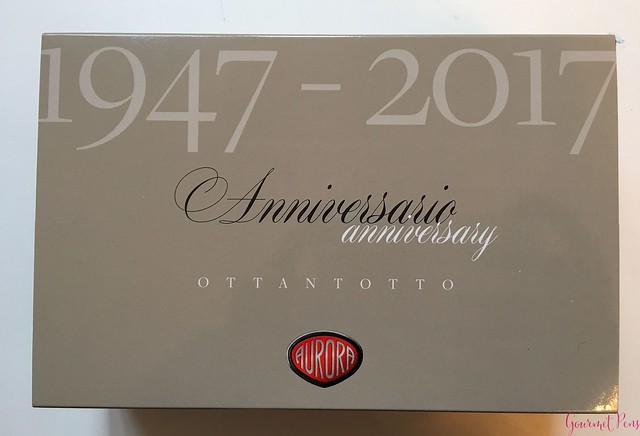
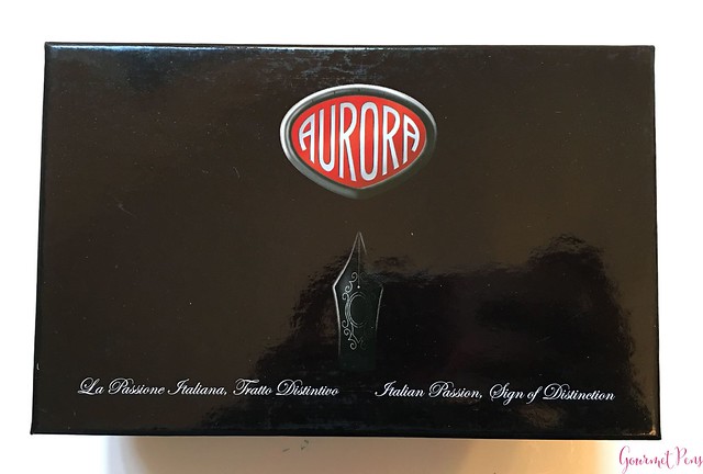
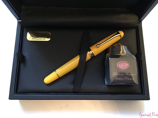
Although this pen is an anniversary special, Aurora has kept the packaging mostly consistent. I like this because it looks uniform and tidy if you choose to keep your boxes. The 88 Anniversario is presented in a large, dark clamshell box with an Aurora anniversary-branded sleeve. The side of the outer box has the nib and pen details. The clamshell box has a leathery feeling to it and has the Aurora logo on top. The inside is a dark leather-like material. The removable bed holds the pen in place and there is also a bottle of ink along with it.
There is an Aurora booklet under the bed with company details/history, pen information, instructions for best use, filling ink, etc. If you are new to fountain pens, this is worth reading through.
The presentation is elegant and classy, but for someone who doesn't keep boxes, I always prefer the most minimal approach. It looks great as a gift though!
APPEARANCE
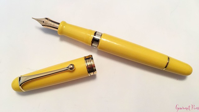
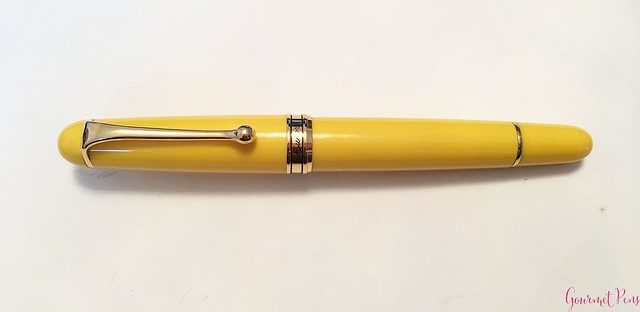
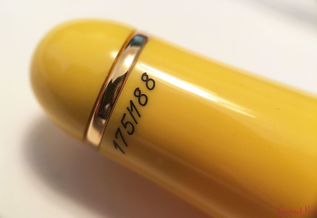
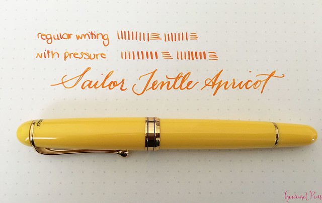
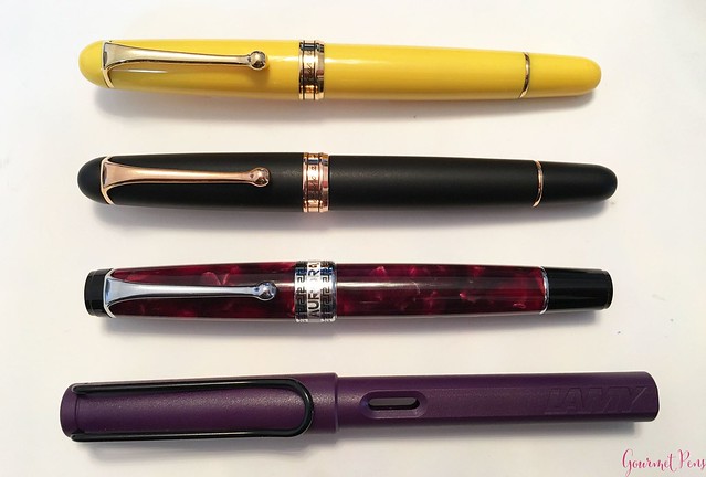
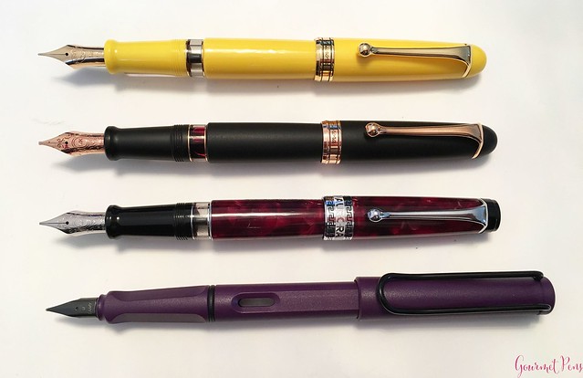
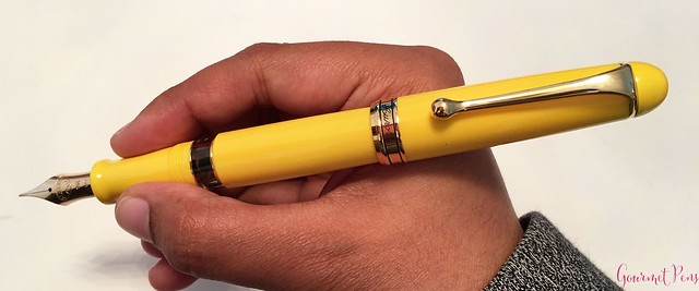
The pen is the modern 88 model. It is a rounded cigar-shaped pen. The finial is a polished yellow dome and is unmarked. The clip is attached by a metal ring around the top of the cap. I really like the shape of Aurora's clips. It is a smooth, curvy clip that ends in a teardrop. On a simple pen, it looks great. The pen is numbered in a black script: 175/188. The black stands out against the yellow, which you may or may not like. I don't mind it.
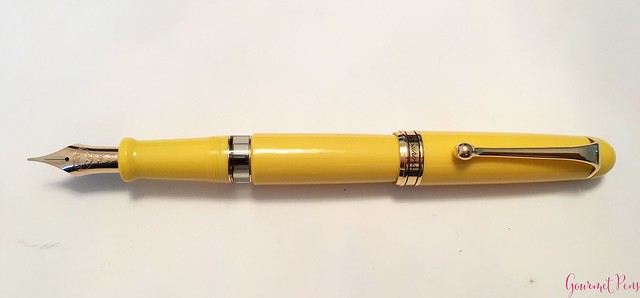
There is a center band located at the end of the cap. It is engraved with 'Aurora' and has two thin black rings in it. It's a simple but attractive center band. There is also a thin metal band at the end of the piston-turning knob. The section is fairly long, tapering slightly towards the nib and ending in a flared ridge. There are resin threads at the back of the section, and a clear, double walled ink window. The ink window is not visible when the pen is capped, and the cap band connects smoothly with the barrel.
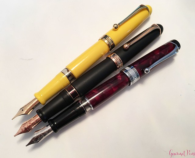
The cap, section, and barrel are a solid yellow resin. It is well polished and does not look cheap or flimsy. Of course, they could have made this spectacular using their Auroloide, but the yellow resin is still a cheery, pleasant color. The clip, center band, and all other trim is yellow gold. Of all the colors being released for this series, the yellow is my favorite, followed by the red and orange.
The pen appears well finished and well made. I observed an evenly-spaced, very small gap between the finial and cap ring but that's about it. Minor detail because it looks like it was intentional.
I have mixed feelings about the choice to use plain, solid colors for this special pen. While the yellow is pretty, I cannot help but think a special Auroloide would have been far more special and outstanding, especially for the asking price.
NIB & PERFORMANCE
The nib is supposed to be the highlight of this pen, of course. Aurora developed this flex nib in an attempt to reproduce vintage flex, from what I understand. Before I go on, let me just say this: I think it's great that a company is still making their own nibs and exploring different kinds of nibs. But, quite simply, it is not vintage flex, but I am grateful that someone is trying.
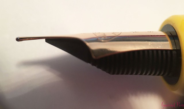
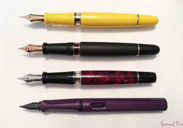
The nib is a cute one. It is a solid 14kt yellow gold nib with wide shoulders and long, rather seductive tines. It is an interesting shape with the wide shoulders and thinned out tines. I find this design interesting because most of my vintage flex nibs have narrow shoulders and modern flex nibs usually have either the same narrower shoulders (i.e. Omas extra-flessible, Pilot Falcon) or cut outs in the shoulder to make the nib softer (i.e Marlon Aleph, Pilot FA, Franklin-Christoph flex nibs, etc).
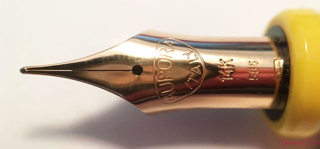
Unlike what the fountain pen community was expecting, the nib does not have the Aurora scrollwork design. In fact, it's rather plain. It has a single slit, a round breather hole, and it is engraved with the Aurora Italy logo, 14K 585, and a hallmark. There is no nib size but all the flexible nibs in this series are fine points.
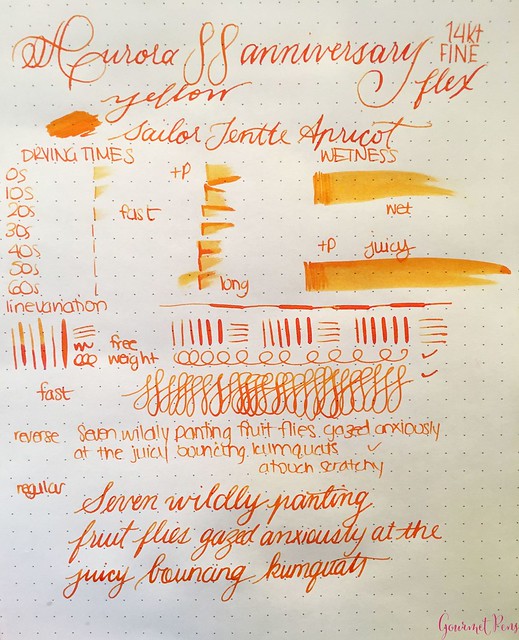
I was expecting a nib something like the Omas extra-flessible nibs - soft, wet, super smooth - maybe even too soft. This one is definitely a fine writer, and it gives a nice, clean fine line with normal writing. It feels firm to me and there is a lot of feedback that borders on scratchiness. I have never used a nib with so much feedback before, and although Aurora nibs typically have some feedback, this is a bit too much for truly pleasant writing. It's noisy, regardless of paper type. I did not experience many hard starts but occasionally it did skip during normal writing sessions (without pressure). I don't think this was because the feed was dry, but because the tines were slightly misaligned from (trying to) flex it and the wrong angle gave way to a skip.
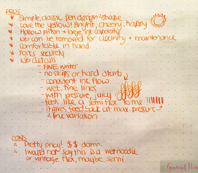
As for being a flex nib... the nib is pretty firm. If you compare it to Aurora's regular nibs, then yes, perhaps it is 'soft', but compared to another soft/semi-flex nib, it's firm. It is not soft when writing and it takes a fair amount of pressure to achieve noticeable line variation. It's not vintage flex, and it's not even a soft nib, but it can offer some line variation so it does qualify as semi-flex. All this flexible terminology can be confusing. What I mean is: it does not feel soft, but since it CAN offer line variation with sufficient pressure applied, it is semi-flexible, but not a soft semi-flexible. If you apply too much pressure, the tines will not snap back in place and ink flow will be hampered. If this happens, you must close the tines and apply less pressure. The amount of variation you can safely achieve is not a whole lot - perhaps a fine to a fat medium, maybe a broad if you really push it.
I did not find it soft or easy to flex so it's easy to use as a daily writer. It's a fun nib because some line variation is possible, but it's not super flexible. The snap back is not fast enough to feel like a responsive flex nib. It offers line variation similar to what I can squeeze out of a springy Visconti Palladium nib or a Pilot Falcon, only with more effort. If you use moderate pressure, you'll get slight line variation but the feed will keep up pretty well. To really push it, I did extensive writing mixing pressure in - it kept up well with moderate pressure and started to railroad with a lot of pressure. The performance in this regard is not bad - the nib hardness limits the line variation so ink flow keeps up. With some other modern flex nibs, the nibs are so soft, the feed can run dry so you can actually flex more than ink flow keeps up.
The good thing about this nib being firm but still being capable of line variation is a new user unfamiliar with flex nib is less likely to spring it than they might a really soft vintage nib.
IN HAND
Have I mentioned I love this clip? It's a snug clip that can be lifted. The tear drop ball at the end is angled underneath so it can be slid on and off papers, pockets, and pouches. It's tight enough to hold the pen in place as well.
The piston-filling mechanism has an interesting design - a hollow piston that houses some extra ink. It's great if you run out of ink but requires some attention when you're cleaning.
The shape of the section is comfortable and long enough to accommodate most grips. The threads are super smooth so will not bite your fingers. The flared ridge at the nib is somehow unnaturally hard and hurts my fingertips if I end up gripping it. The section is not slippery, even with longer writing sessions.
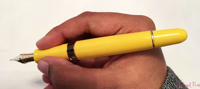
Unposted, the pen has a comfortable length and is on the light side. It feels well balanced. I think if you have larger hands, you'll have to post it to give it more length. The cap can be posted snugly by friction and it gives the pen a bit more weight and length, which feels right and more comfortable for me. I love that it isn't a super heavy metal body. It's lighter and doesn't tire out my hand.
PROS & CONS
OVERALL
I like the Aurora 88 model. I have previously reviewed the Black Satin version with rose gold trim and I am definitely a fan of the features and the design. The yellow is a pleasant addition to my colorful pen case and I enjoy using a variety of nibs, not just for work-type reasons but also for creative fun. In that regard, this nib is enjoyable. The major downside, in my opinion, is the price of this pen. You can get a softer, more flexible nib (Pilot Falcon, for example) for far less.
As I said: quite simply, it is not vintage flex but I am grateful that someone is trying. The downside is the pen is quite expensive for a semi-flex, and although I justified it to myself (piston filler, gold nib, 'flex' nib, limited edition), it's just flat out expensive. I think it's an expensive way to release a new nib and is not easily accessible as such. Especially because it's limited to 188 pieces!
Am I happy with it? Yeah, for the most part. Sometimes the price tag of a pen doesn't match the value and enjoyment you get out of it, and in this case, my enjoyment is a bit lower than I was hoping for relative to the price, but I like to experience different nibs and I am satisfied I was able to try it out. I have fun with it.
I received a discount on this pen so I could review it here! I have not been compensated monetarily for writing this review. Everything you have read here is my own opinion.
Help keep the ink flowing! By contributing as little as $3 per month, patrons help me to dedicate more of my time to creating what we both love by helping cover the many costs incurred from my work!













 Posts
Posts


