Showing posts with label Vanness. Show all posts

Tuesday, January 19, 2021

Gourmet Pens Picks - Paper for Fountain Pens - Galen Leather Everyday Tomoe River Notebooks

Gourmet Pens Picks - Paper for Fountain Pens - Galen Leather Everyday Tomoe River Notebooks

Title screen image by Galen Leather. My notebooks were purchased from Vanness Pens. Apparently Galen Leather has more COLORS AND SIZES! I can't wait to explore them more. 

Folded nib by Toronto Pen Company


If you enjoy and/or appreciate and you want to lend your continued support, please do check me out on Patreon. You can pledge your support and/or undying love for as little as $1. You are in no way obligated to do so. I appreciate your readership, viewership and your support so much - thank you! 


The P.W. Akkerman x Gourmet Pens Pink Ink Collaboration:
Need some more PINK in your life?

/ᐠ。ꞈ。ᐟ\*ᵖᵘʳʳ*

P.W. Akkerman
Vanness Pens
Lemur Ink
Bookbinders Design
Laywine's (call or email)


Tuesday, May 5, 2020

Colorverse Inks 59 & 60 Ginkgo Tree & Golden Leaves

Colorverse 59 & 60 is Gingko Tree and Golden Leaves is such a beautiful pair. The larger bottle is 65 ml and that color is the brown Gingkto Tree. Golden Leaves, which is just delicious, is the wee adorable 15 ml bottle. The inks are available in the boxed set and as always, my favorite color is the smaller bottle. I love the theme of the pair. Gingko leaves are so cute and pretty and I love their shape and yellow ink in this shade is my thing so this set really spoke to me. I saw it quite some time ago at a pen show at the Vanness Pens table and I couldn't leave without it. Had to check out that yellow!

The little bottle is super handy for traveling with, like taking to pen meets to ink up a pen or two. It's just so tiny and adorable, like a wee little snail. The bigger bottle shares the same shape but it's larger and less cute. Like a larger, still cute snail, but not as cute. Gingko Tree is a medium brown ink that shades nicely and is a touch dry. It has a touch of red in it so it's on the warmer side, which is how I like my brown inks in general. Golden Leaves is a warm yellow, leaning toward the lighter yellow side. It shows some shading and flows well. Both inks are pretty well-behaved and are easy to clean. Golden Leaves can be a little difficult to read if your nib isn't wet enough. It looks stellar in a nice wet stub nib. In fact, all inks look best in a wet stub nib, but in this case, both inks shade beautifully if you use a wide nib.

Overall, I have no complaints. I'm not really a packaging person but Colorverse offers an experience, with a bookmark/pen stand, stickers, napkin, and ink details. I don't have the space for so much packaging but I don't have many Colorverse inks so in this case, it's not too bad.

I know they're not inexpensive but they're unusual and inspired. You can grab the pair for $36.00USD. Not bad because you get some seriously special packaging and two great inks.
Colorverse Inks 59 & 60 Ginkgo Tree & Golden Leaves 3_RWM
Colorverse Inks 59 & 60 Ginkgo Tree & Golden Leaves 4_RWM
Colorverse Inks 59 & 60 Ginkgo Tree & Golden Leaves 2_RWM
Colorverse Inks 59 & 60 Ginkgo Tree & Golden Leaves 1_RWM

Tuesday, March 31, 2020

Vinta Inks Blue Floss Perya Stole My Heart.

Vinta Inks are obsessively designed and meticulously mixed. Our inks are meant for fountain pen or calligraphy use. We promise that we use the finest ingredients to make the best ink that we can.
Vinta Inks are made in the Philippines and they have a pretty cool initiative that I didn't even know about until I started reading up more about them.
At Vinta, we believe that education is one of the most important paths towards poverty alleviation. That is why for every bottle of ink you purchase, we will donate P25.00 to Teach for the Philippines, Inc. in their goal to provide access to quality education for all Filipino children. Help us make the world a more colorful place, one bottle at a time. 
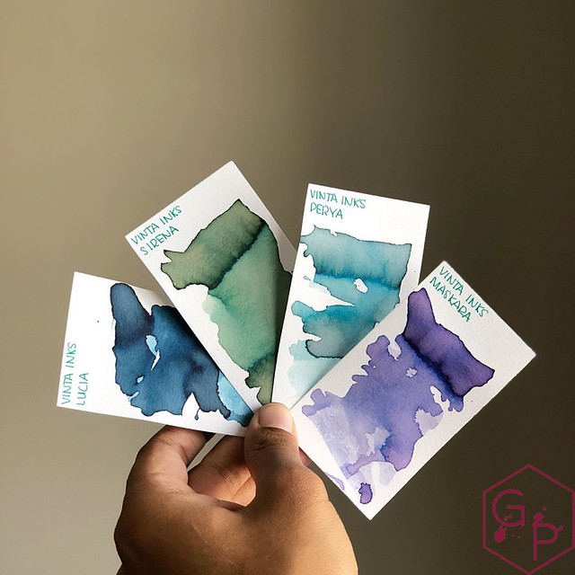
That's pretty cool. I always like supporting companies that are trying to do something for someone else. It's just nice to see they have a bigger picture in mind. Of course, I picked these colors long before I knew about their initiative. These are the four colors I went with, and I am telling you, it was hard to pick just four: Deep water Blue Lucia, Mermaid Green Sirena, Blue Floss Perya, and Violet Maskara. I did not know the background behind the names but I love the names and it's really interesting to learn about the Philippines and the inspirations. They are whimsical and fun, and educational! The boxes are adorable and classy and the round amber bottles are simple and easy to fill from.

  • Deepwater Blue - Lucia - this is a gorgeous medium blue with greenish undertones. It shades to a lighter blue but doesn't get too dark. It definitely does not feel like "just another blue" to me. 
Dyesebel is one of the most important Filipino comic book characters in Philippine history. It was originally created by the Filipino illustrator Mars Ravelo. Lucia is the name of Dyesebel's mother. She was obsessed with collecting and gazing at artistic depictions of mermaids while she was pregnant, so the baby (Dyesebel) was born with what looked like a fishtail instead of legs.  Dyesebel's first appearance in the comics was in 1952.
  • Mermaid Green - Sirena - what a mystical green! I love how the color changes as it shades - it's a very blueish mint green and there's definitely some grey in there. I don't see a whole lot of pink showing up but wow, is it ever pretty!
Sirena is an homage to Mars Ravelo's famous Filipino comics Dyesebel about a mermaid. It is one of the most popular local comics that was serialized in 1952. This beautiful mint green has undertones of grey and pink.
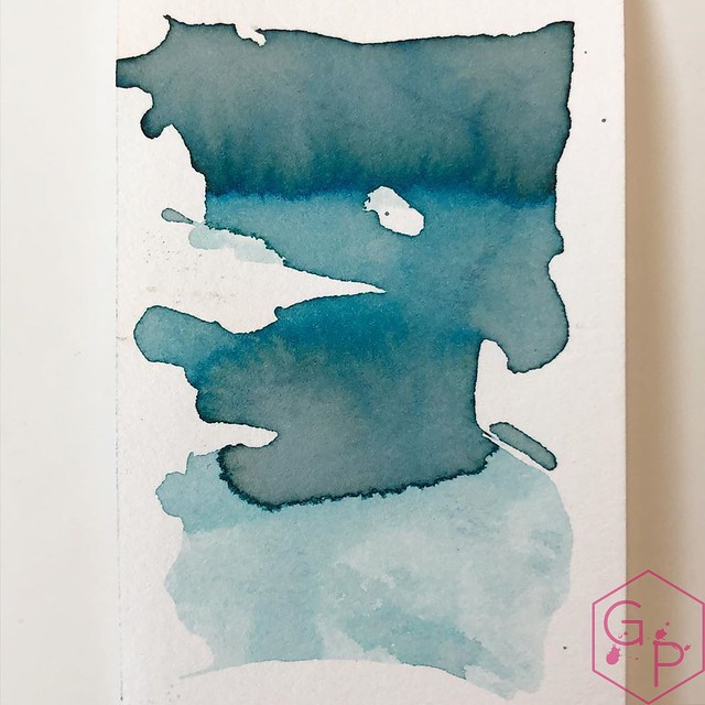
  • Blue Floss - Perya - You know how I feel about things named after food, right? Especially cotton candy, which is one of my favorite things. Sweet as heck, but I like how it looks and the color mixture is captivating, and the texture is soft and perfect. This is my favorite of the bunch. I love the yellow/peach and blue. I can see the cotton candy. I can taste the cotton candy.
One of the most beautiful parks in Manila is Luneta Park built in 1820. It is now known as Rizal Park, named after the national hero of the Philippines, Jose Rizal. Very near the pier, many children and adults enjoy blue cotton candy as they stroll along the park. 
  • Violet - Maskara - What a pretty violet! You can see the blue in the shading and boy does it ever shade! It ranges from a light lavender to a violet-blue, and it matches the other three colors in its whimsicality. 
The maskara festival was conceived in part due to the sugarcane crisis in Negros. 1890 was the year the Spaniards split Negros region into two: Negros Occidental and Negros Oriental. These regional divisions remain today. 
They're beautiful in clear pens because they're not super saturated. Inks that shade well usually look fabulous in a clear pen, so obviously these have to go in clear pens. I am discovering I don't have enough clear pens for all my shady inks.

I picked up my selection from Vanness Pens quite some time ago - in fact, I think it was at the DC Pen show in 2019?? WOW. Time has flown, how disturbing. Here's their current selection! No commission, I'm just happy to refer you to them. You can follow Vinta Inks on Facebook & Twitter - @inksbyvinta.
Vinta Inks Blue Floss Perya Stole My Heart. 1_RWM
Vinta Inks Blue Floss Perya Stole My Heart. 2_RWM
Close up swab of that Blue Floss Perya!

Tuesday, March 17, 2020

KWZI Sheen Machine - Saturated but Flowy!

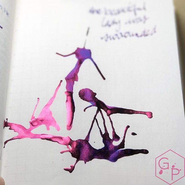
There was shimmer, there was shading, and there was sheen! Sheen is that shiny layer on an ink that comes from having a heavily saturated color. The downside to sheen is that, because the ink is so saturated, the flow can be hampered. It can get stuck in your feed and end up gumming up in there. KWZI wanted to create a sheeny ink that would be super saturated enough to give off that radiant glow but still flow well. How did they do? Pretty well. Sheen Machine is a beautiful, deeply saturated blue ink that glows red with ease. You don't really have to use special paper like Tomoe River, a known sheen-finder, and I can attest that it will sheen on almost anything (like my hair, which I one day inadvertently dragged through wet writing. See below!).

Drying times are pretty long, which one can expect with highly saturated inks. I left the ink in my Lamy Safari for weeks and it didn't dry out for quite some time, and it didn't have trouble starting up either, so that's great. Eventually, it will need cleaning and that is not fun. I gave my Safari to a friend to clean and he brought it back a day later with a really distressed look and asked me what the heck I had in the pen. Oops.

It's a really fun ink for popping highlights and writing with flair. I don't use it for writing letters and the such, I more so use it for doodling highlights, banners/flourishes, and fun stuff.

Grab a bottle at Vanness Pens for $15USD! No affiliation, just sending you somewhere to find it!
KWZI Sheen Machine - Saturated but Flowy!_RWM
KWZI Sheen Machine - Saturated but Flowy! 2_RWM
KWZI Sheen Machine - Saturated but Flowy! 3_RWM
KWZI Sheen Machine - Saturated but Flowy! 4_RWM

Tuesday, March 10, 2020

Akkerman Gourmet Pens Pink Ink Looks Fab in the Esterbrook Estie Lilac (100% Unbiased.)

100%. I swear. I have no bias here except for the fact that I picked the ink and I love Akkerman and I love my Lilac and - well, I am biased. That's ok. Just because I'm biased doesn't mean I am wrong!

There's a lot of goodness going on here:
  • The sweet Superior Labor A5 Folio from Wonder Pens, which I bought several years ago and have used constantly ever since. Partially to justify the price to myself, but mostly because it's super convenient and robust. Also, it looks really good in pictures. 
  • The Atelier Musubi Cat notebook, which was gifted to me from the DC Pen Show this year. We literally got there, snagged this (and several others), and I treasure it. I've been making all sorts of plans for it, and whereas I used to be too afraid to use nice notebooks, now I am eager to get in there and enjoy every square inch of it. This particular cover was a special one so there are only a few out there! They're adorable. What's so special about Musubi? This is what they say and I am pretty happy to buy from them!
Built upon the twin pillars of obsessive craftsmanship and an enduring social mission, Musubi is an atelier devoted to the careful, ethical creation of small goods.
Our operations exemplify our philosophy of direct impact:
In Singapore, our bookbinding atelier employs only persons with physical and intellectual disabilities, providing them the employment stability and opportunities they previously lacked.
In Peru, Indonesia, and other countries across the globe, we work with indigenous communities threatened by violence, climate change and political upheaval.
By paying our artisans a fair price for their work, we establish proper infrastructure and employment, ensuring both that traditional craft is not lost to the ages, and that the most vulnerable amongst them — often women and children — have safe places to live and a future to strive for.
The end result: every Musubi creation directly and measurably benefits the least fortunate amongst us. Come along with us as we tell a story with meaning.
  • Live Notes Tomoe River notebook from Pen Gallery - I love Tomoe River. I usually prefer the 52gsm but this notebook is A5 - one of my favorite sizes - and it's so easy to carry around in the Superior Labor folio. Perfect for writing samples. 
  • Esterbrook Esties - you'll see three different ones here, from top to bottom: Estie Regular Lilac, Estie Regular Blueberry, and the Estie Violet Slim. The Slim has a #5 nib, unlike the #6 nib on the Regular and Oversize. I know I say this every time they release a new color, but the Lilac, Violet, and Blueberry are just delicious. 
  • Last but not least, and the most biased part of this is the pink ink. It's my collaboration ink with PW Akkerman in The Hague (the only Akkerman that makes and sells these inks). It comes in the awesome fluted bottle with the nifty marble and it's sexy and I picked the pink. You can get it straight from Akkerman,  Vanness Pens, Lemur Ink, Bookbinders Design, and Laywine's in Canada. 
    • Side note: PWA has have provided a discount code - 10% off using GOURMET10 ⁣⁣(excludes Montblanc, sadly, their Akkerman inks, discounted products, unfortunately)⁣⁣ However. There's a lot of other goodness:
Akkerman Gourmet Pens Pink Ink Looks Fab in the Esterbrook Estie Lilac (100% Unbiased.)_RWM

Thursday, September 26, 2019

Esterbrook Estie Tortoise Fountain Pen Review with some Vintage Nibs

Thank you to Vanness Pens and Kenro for providing this cute pen for a review! I think it's a really interesting take, not to sound weird about myself or anything. The reason is Kenro ran into some issues with this pen, which I talk about in this video, and they resolved it in a classy manner. I'm happy about it.

Check out the Esterbrook Estie pens at Vanness Pens
Music: BenSound

Friday, August 23, 2019

Esterbrook Estie Honeycomb Oversize Fountain Pen & Rollerball

Thank you to Kenro, Fountain Pen Day, and Vanness Pens for providing these pens for a review! You can shop for them at Vanness Pens!
Related Posts Plugin for WordPress, Blogger...
 
Creative Commons License
GourmetPens by Azizah Asgarali is licensed under a Creative Commons Attribution-NonCommercial-NoDerivs 3.0 Unported License.
Based on a work at http://www.gourmetpens.com.
COPYRIGHT©2010-2026