Darn these clear bodies. When will you stop showing your heart to me and making me fall in love with you? Le sigh. Here we are, another nekkid pen. With a nib that gives line variation... double le sigh.
ABOUT
Body Material: Plastic
Trim: Metal (chrome coloured)
Length (capped): 12.0 cm
Length (uncapped nib-end): 10.8 cm
Length (posted): 13.4 cm
Barrel Diameter: 12.0 mm
Section Diameter: 10.6 mm
Nib material: Steel
Weight: 17g/0.6oz
Fill type: Cartridge/converter
Price: $58.00USD
Where to buy:
JetPens
PACKAGING
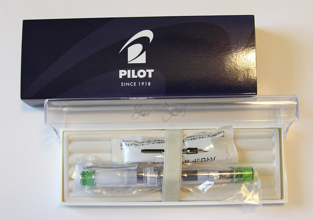
This pen came in a plastic sleeve, nestled inside a plastic box. The lid is clear. The pen sits in a felt-lined plastic tray with slots for pens. It also came with an ink cartridge and a CON-50 converter (loaded in the pen). The packaging is not too shabby - it could be used for storing other pens safely as well.
APPEARANCE
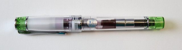
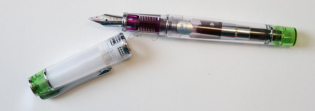
The Pilot Prera clear body fountain pen is a fairly small pen. It has the appearance of being quite light - that it is made of plastic is obvious. The metal accents are very thin and do not contribute much weight. The end of the cap and the body are highlighted by a light green accent (can be acquired in various colours). The cap is mostly white, obstructing view of the nib. Near the center band, also in white, there is a dotted patern and Prera written. I'm not really a fan of the cap's appearance. The body is much cooler - simple and clear. Visible section and barrel. The cap really throws off the appearance of the pen, unfortunately.
NIB & PERFORMANCE
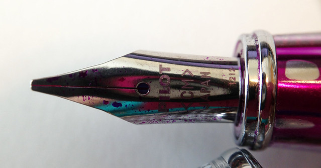
I very much like this nib - the appearance of the nib itself is simple/ - there is a breather hole, it is labelled with the nib size, Pilot, and it says Japan. I love calligraphy nibs. This one is not very sharp so most users can use it comfortably and without a great learning curve. It will offer users some nice line variation in their writing without much effort.
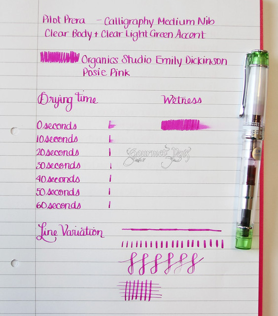
I found the nib to be slightly dry after writing for awhile (10 minutes of writing) - perhaps lacking enough air exchange. It wasn't too bad and did not reach the stage of skipping, nor did I have to open up the pen and prime the feed. It's also obvious from the drying time test and the wetness scribble that the pen writes a little dry. It does not handle flexing either (not that you should need to!).
IN HAND
Given that this pen is so small, I had to write with it posted. Unposted, I could still write with it but it was more comfortable posted. Those with larger hands will definitely need to post it. It is also very light, especially unposted, so posting it gave it some more weight. I can see the light weight of it being an issue for some users. If you prefer heavy pens, this may not be up your alley.
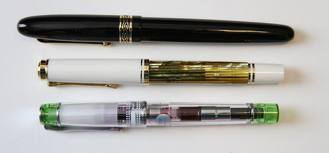 |
| Top to bottom: Italix Parson's Essential, Pelikan M400 white tortoise, Pilot Prera Clear Calligraphy Medium. |
PROS
- Clear section- very cool to look at the feed!
- Comes in a variety of accent colours that are really quite attractive.
- Nib offers line variation with almost no effort on user's part.
- Very little learning curve - nib is very forgiving.
CONS
- Horrendous lid. Too much white on it.
- A little more expensive than I'd like.
- Quite light and small. (Not an issue for me but for others, it will be!)
OVERALL
Ah yes, my affair with clear bodies continues. This one has a lot going for it, but a major flaw as well. The size is very nice, somewhat cute. Gorgeous appearance, especially with the light accents (in this case, the light green). I hate the white inner cap. I really don't know what's up with that. But I love the clear feed and I love the rest of the pen. Enjoyable nib to write with - reliable, no skipping, no hard starts. At $58.00USD, It's about $10 - $15 more than I think it should be, but oh well. I'm not reasonable about pens on the best of days. A much cheaper alternative would be a
Plumix, but this body is far better looking, more convenient, and more comfortable.


5 comments:
Awesome review as always. We agree on many things with this one. I bought it during a demonstrator acquisition fit and I didn't do much pre-study. The cap is a bad design for a demo'r and the pen was too small for my tastes. Too bad because it was a good writer, though I had the more boring medium. You're ink color choices are the bomb BTW
Nice review! When I got my Prera, it didn't have italic nib options. So I actually got the Plumix for like $8 and switched out the nibs. I totally agree with you about the cap; what were those Pilot peeps thinking? It really sucks to get ink between the outer and inner caps. Boo minus. But it's a fun little pen otherwise.
Hi Azizah,
Thanks for the lovely review. I really appreciate your fine writing samples. :)
I know they're interchangeable, so I was wondering if you could tell me if there is actually any difference between the CM nib on the Prera and the M nib on Plumix.
You're welcome! Glad you like them :)
I'm not 100% certain but just based on memory and comparing them myself, I'd guess they were the same - not marked the same though. The Prera is CM and the Plumix is M, but they seem to be about the same italic width.
Thanks for the reply! I was just wondering because I'd like to have a Prera with a calligraphy nib, but I'm also not a fan of the wretched white cap on the demonstrators for which a calligraphy is exclusively available, so I was planning on doing the old Prera/Plumix nib switch trick. I was just worried that—based on the price difference—there might also be a difference in the quality of the nib. Also, here in Europe one can buy a Plumix set with three different calligraphy nibs for about 20€, so it's a fairly inexpensive way to get a solid lineup for the Prera. Thanks again!
Post a Comment